SIGNAGE
DESIGN AT THE HIVE
CLIENT
The Rick and Susan Sontag Center for Collaborative Creativity (the Hive)
MEDIA
Environmental graphics
Wayfinding and signage
PROJECT SUMMARY
The Rick and Susan Sontag Center for Collaborative Creativity is a resource center that focuses on cultivating creative capacity and collaborative skills in college students. Through courses and workshops, students learn to navigate ambiguous problems with a generative mindset. Above all, the center is a space welcome to all to come open their minds and experiment and play without the fear of failure. The physical space did not fully reflect that the creative design message that it teaches. My team and I focused on designing and implementing consistent visuals in the space to assist users in navigating the space.
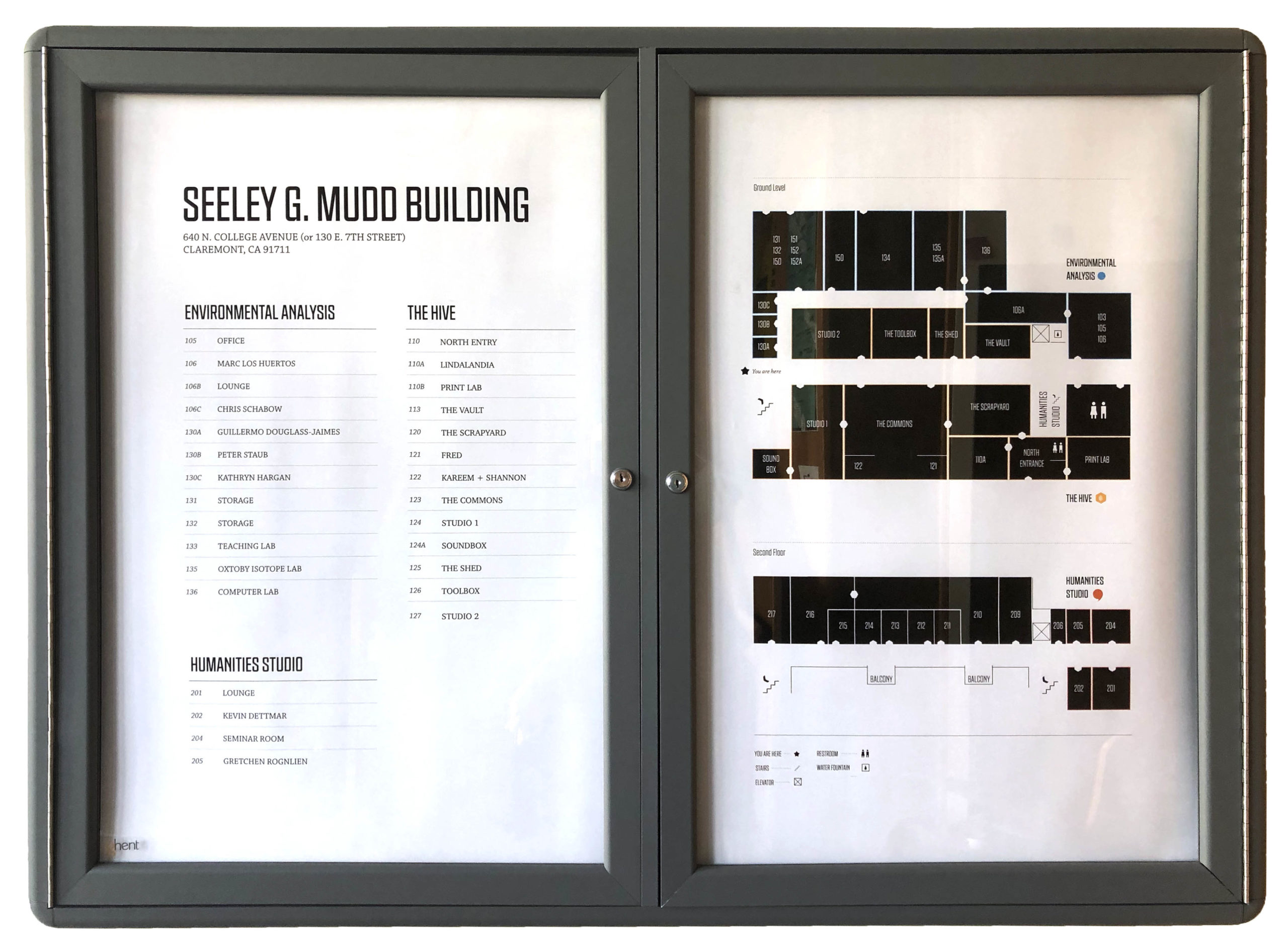
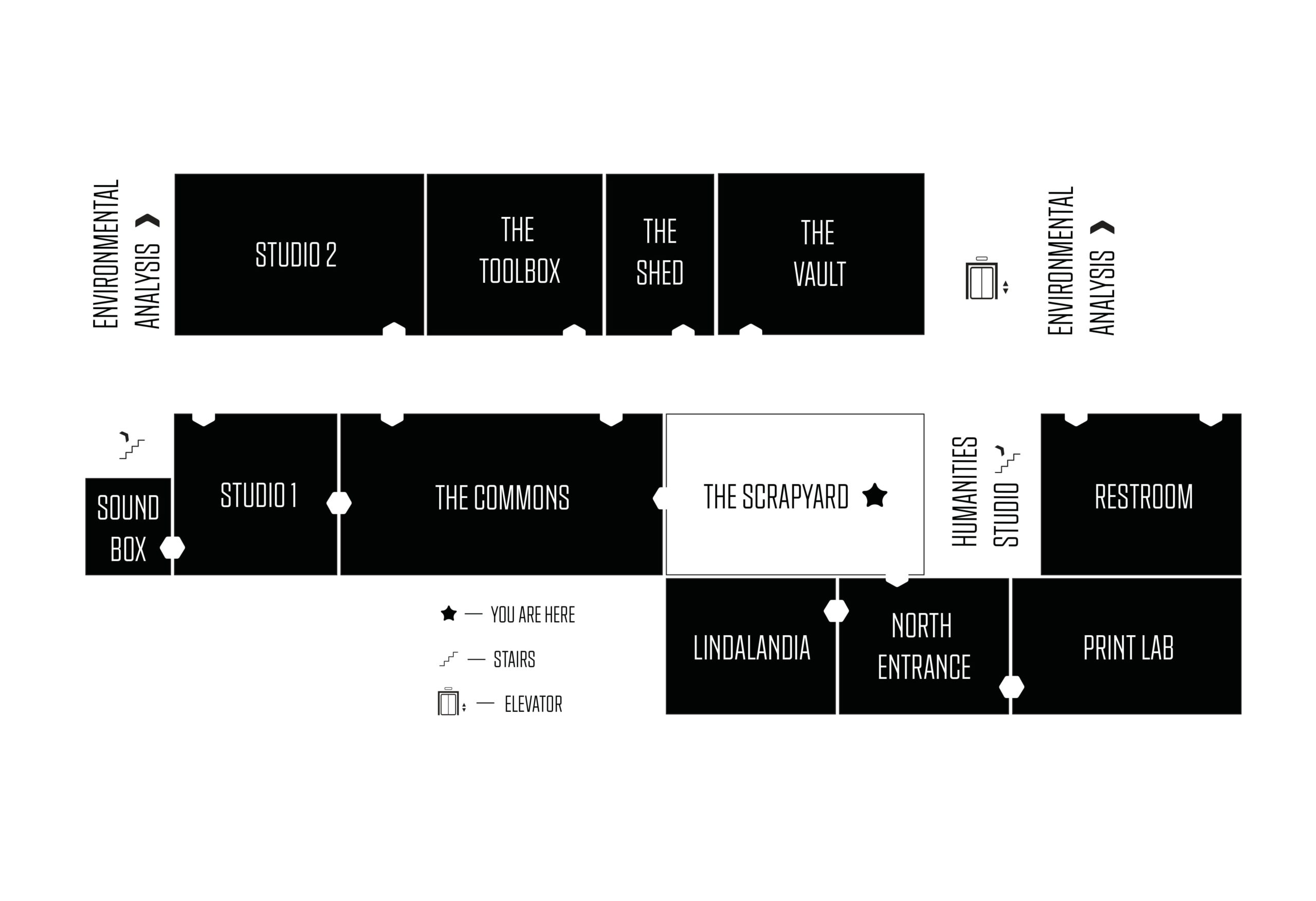
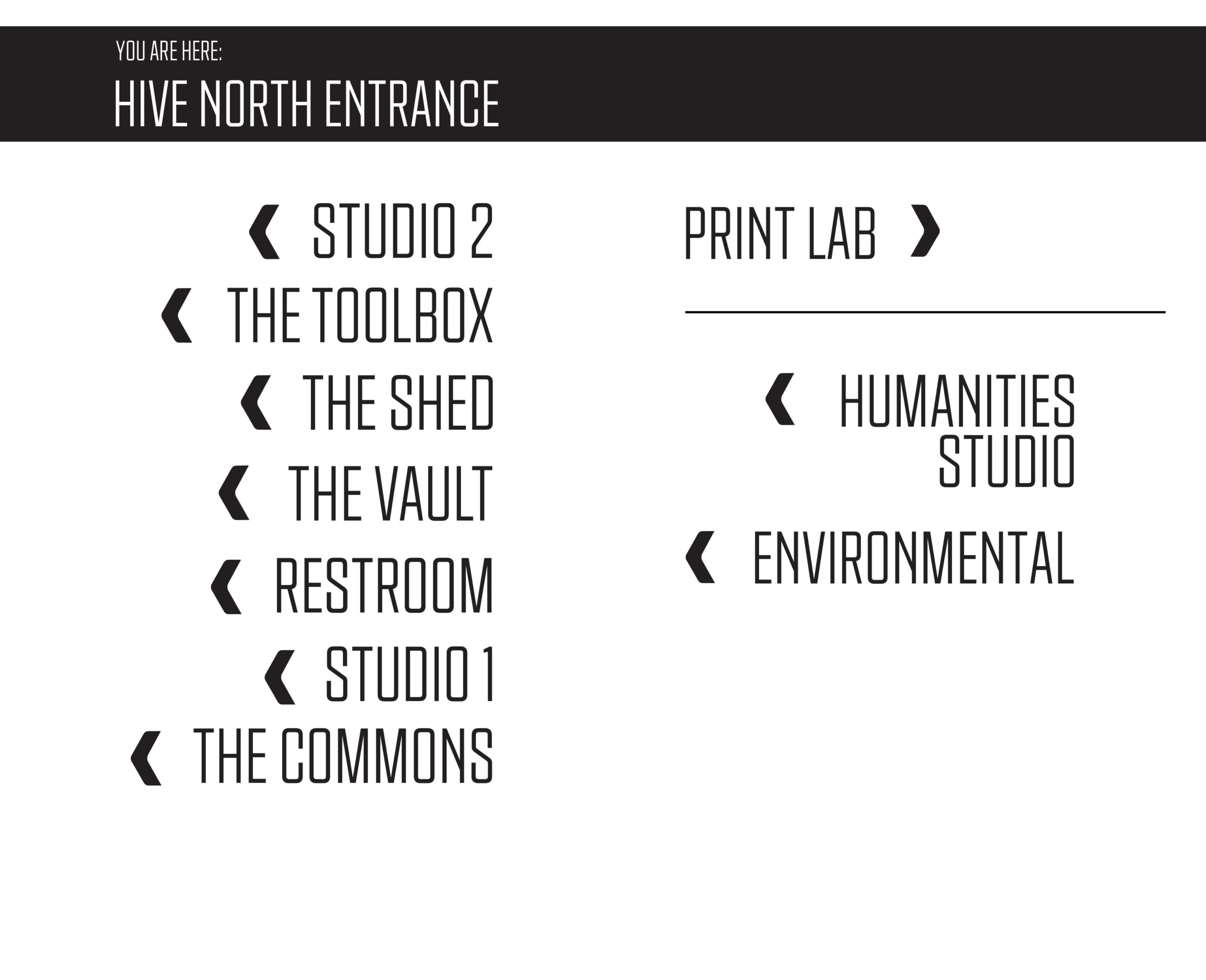
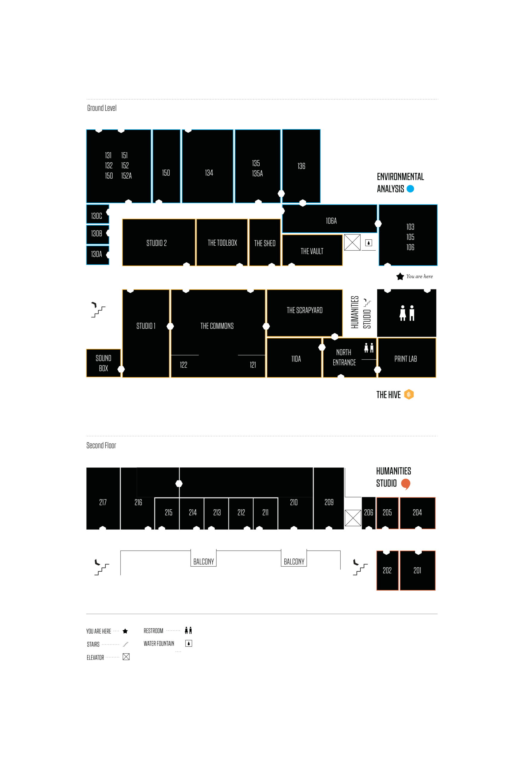
1. Directory, Maps, and Room Labels
The Hive, being the home to many classes and workshops coupled with its insistence on out-of-the-box room names, causes for some navigational disasters.
“Excuse me, where is the Shed?”
“Do you know where I can find the commons?”
“My class is in the toolbox, is this the right building?”
These are just a couple of common questions, overheard at the Hive everyday. To limit the distress of our users caused by navigational ambiguity, we set out to design directories, maps, and large room labels that were both informational and aligned with the Hive's brand.
The design of the directory uses simple black boxes to detail each of the rooms. The door openings are hexagons (reference to the logo) and the text is simply laid out for easy reading and access. The center shares the building with two other organizations so they are also included on the map using color coordination
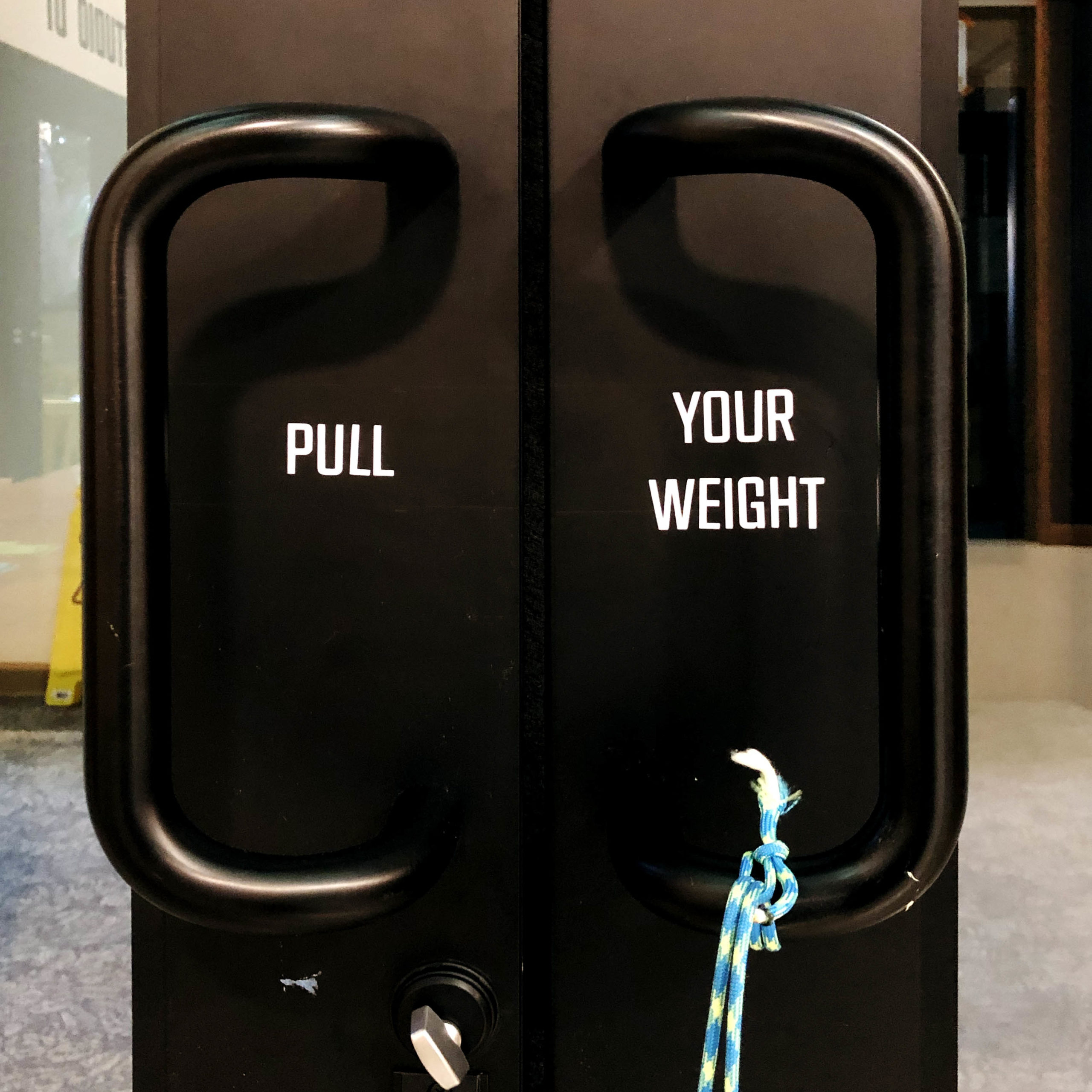
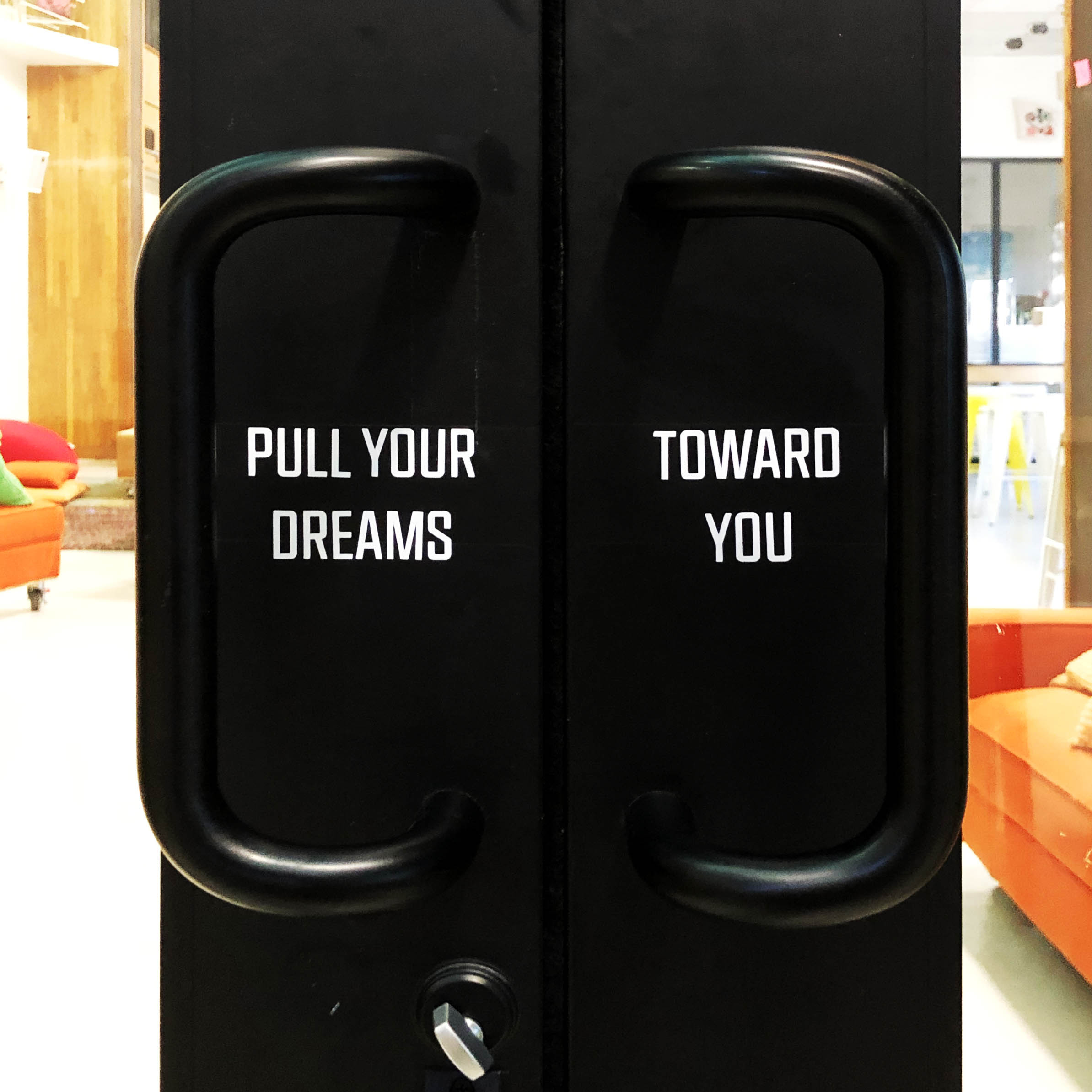
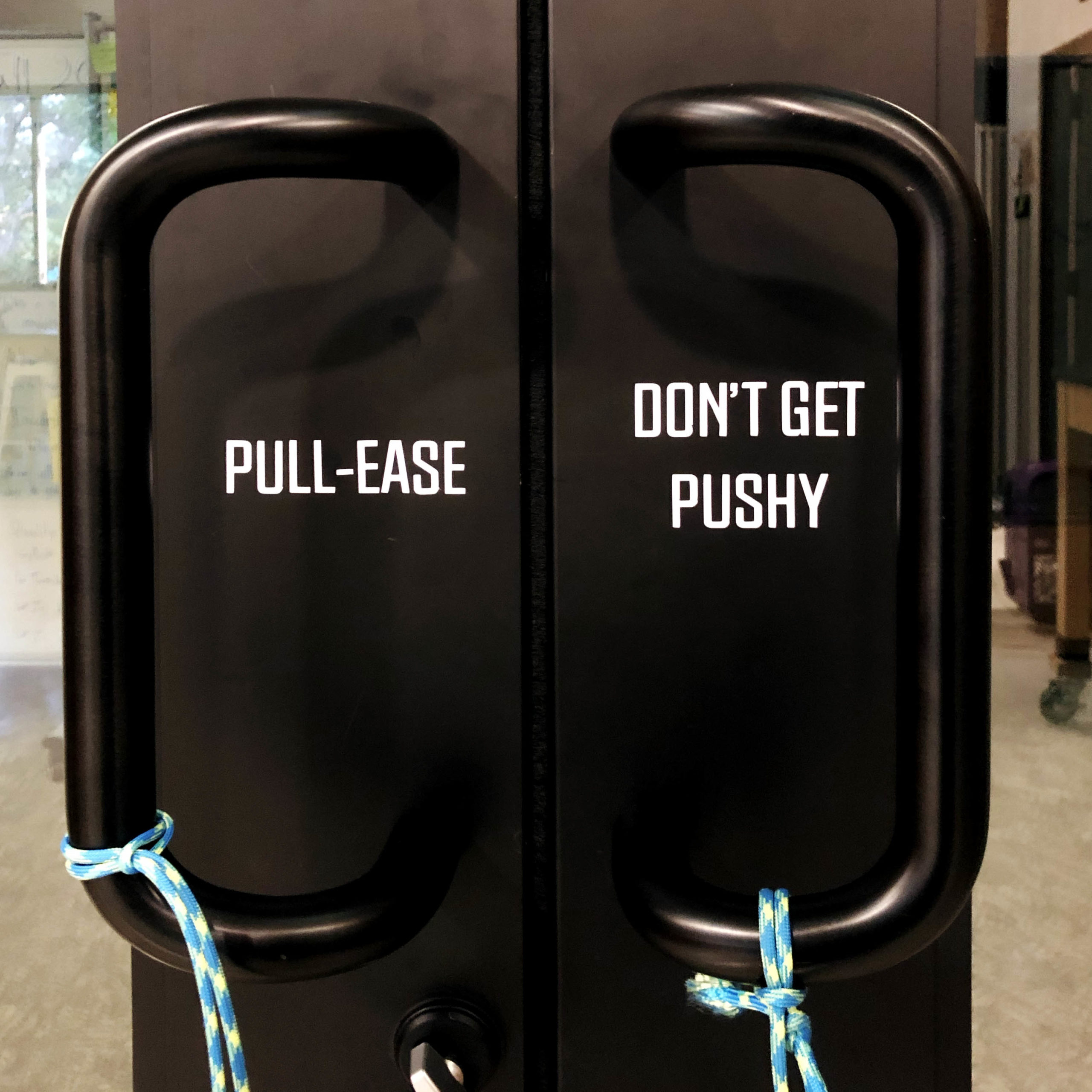
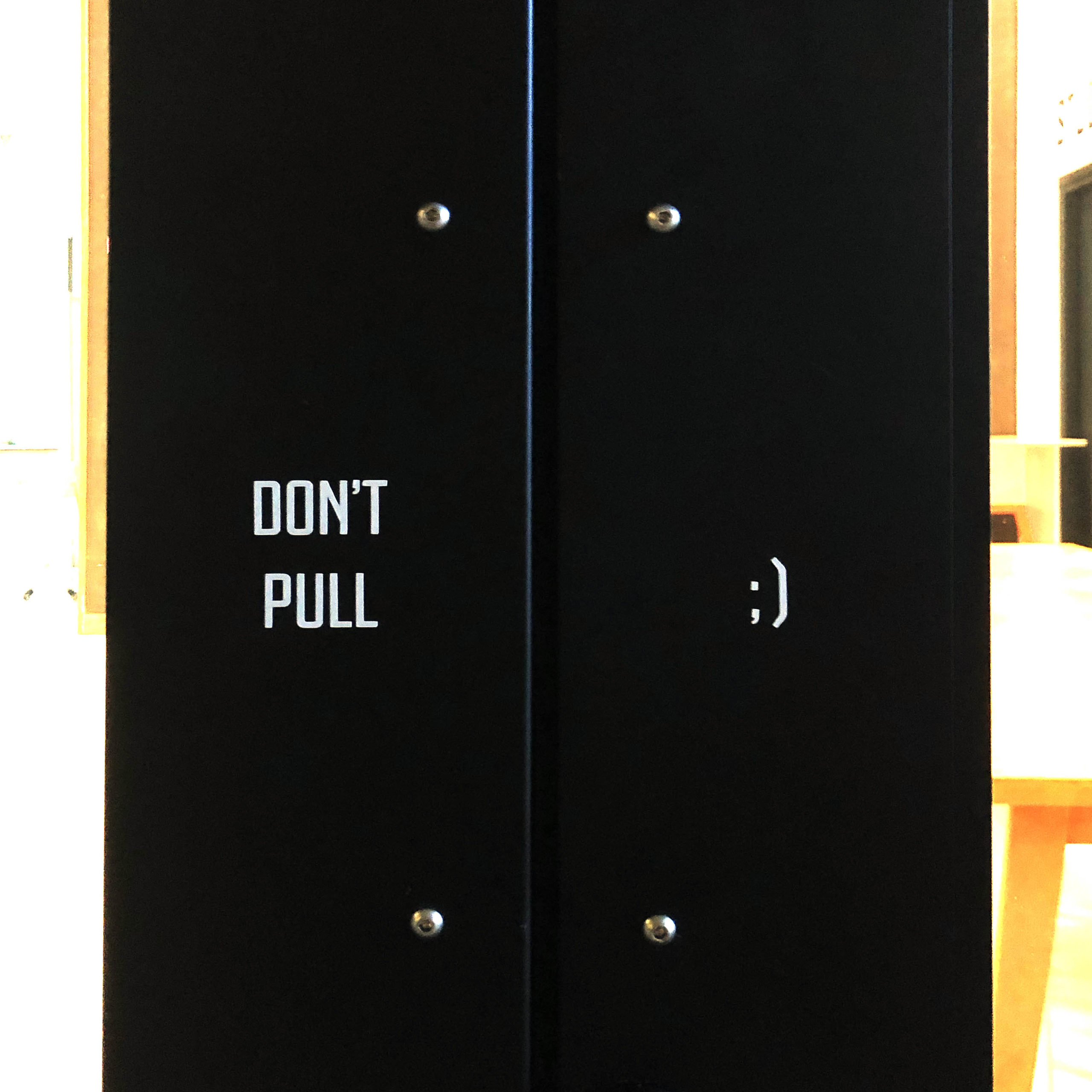
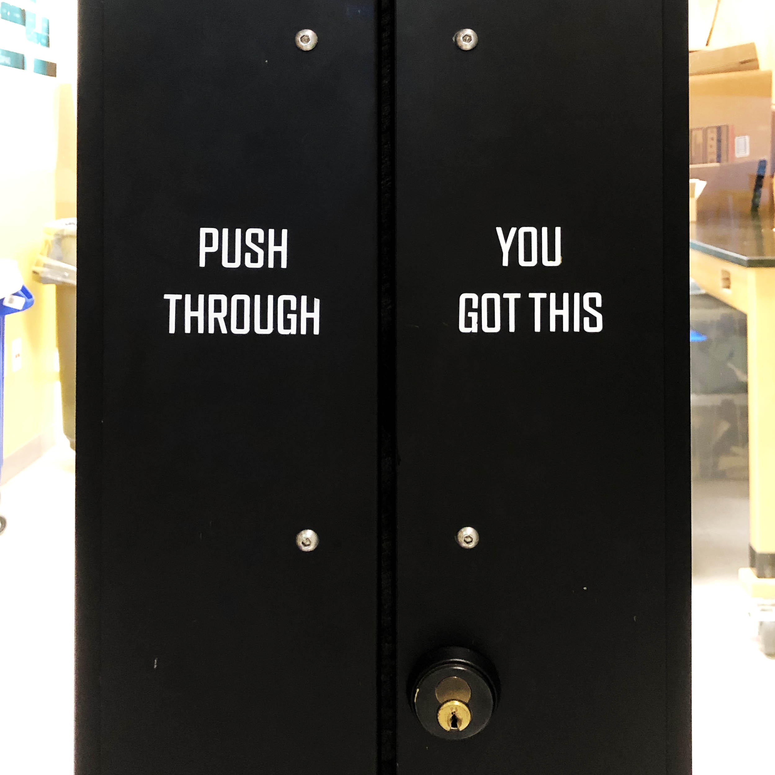
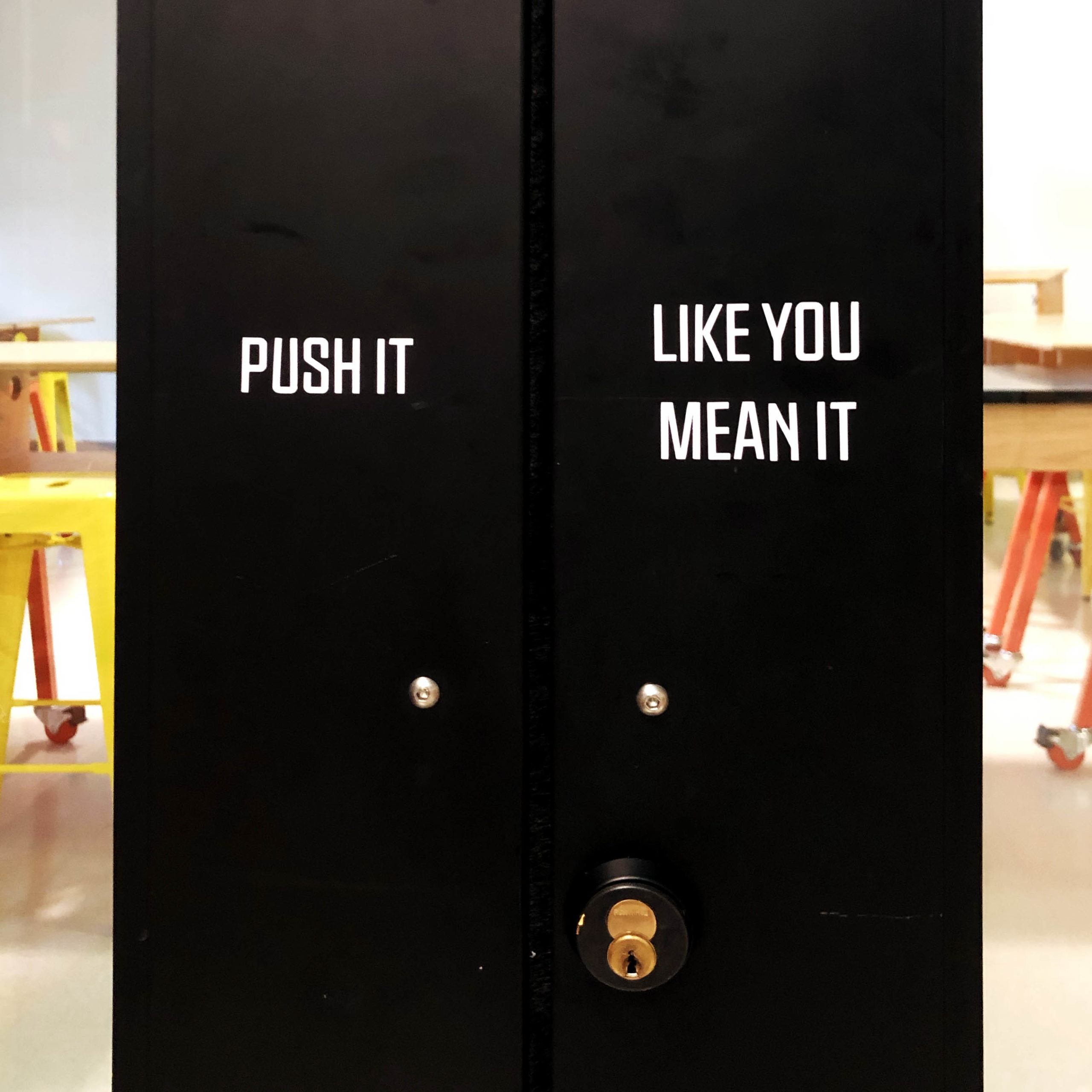
2. Door Handles
When met with handle bars on a door, the intuition is to pull. However, since the Hive’s doors have handlebars on both sides, it makes for some frustrating encounters with the door. We took this opportunity to redesign the experiences walking through the different doors to get to spaces within the Hive. My team created a handful of fun alternatives for push and pull handle text for the doors. They are cut and applied in house using white vinyl.
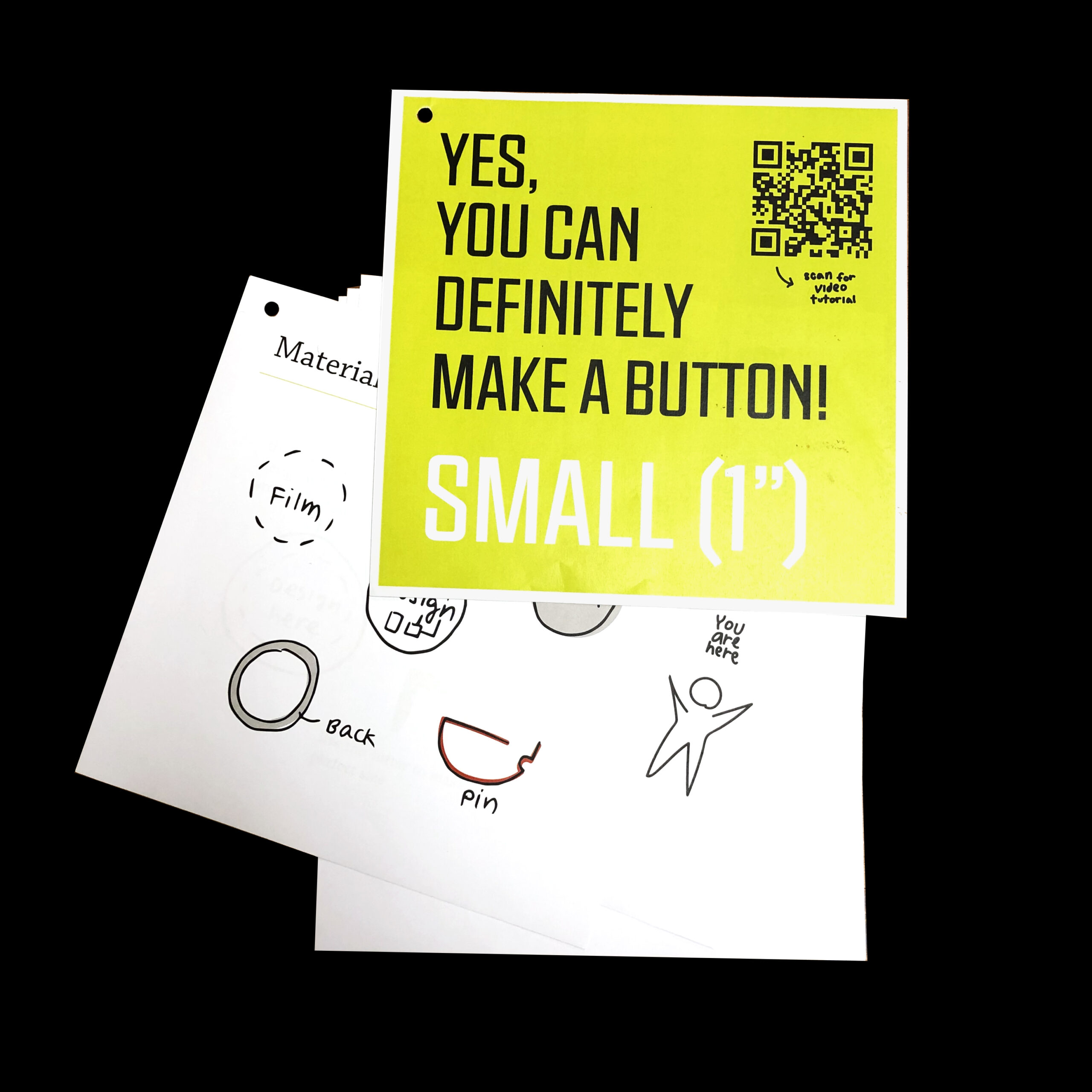
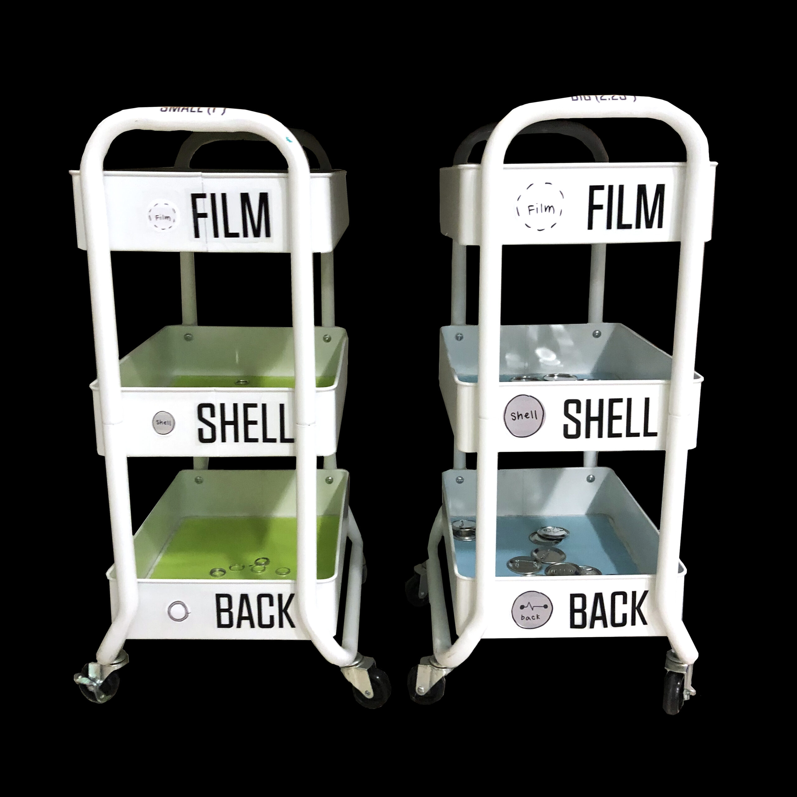
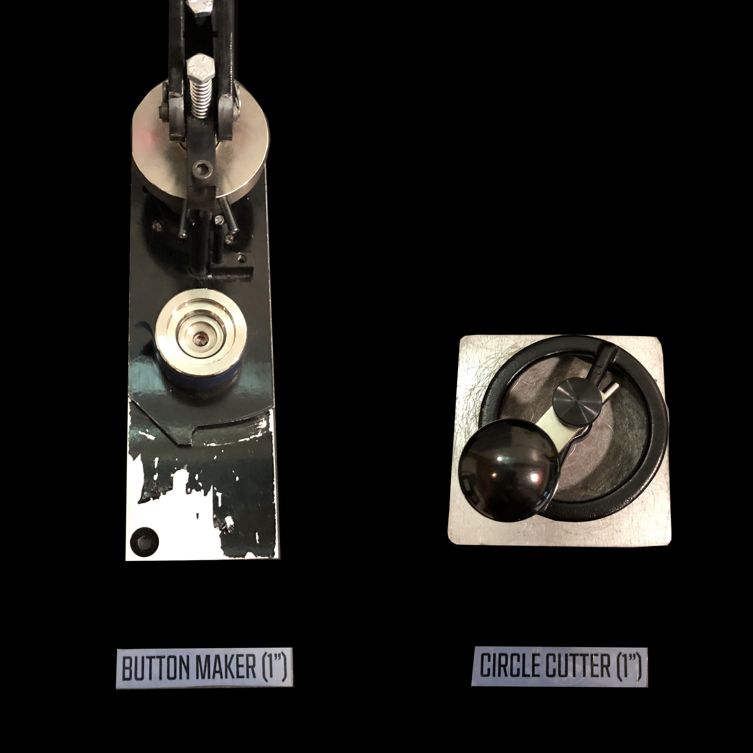
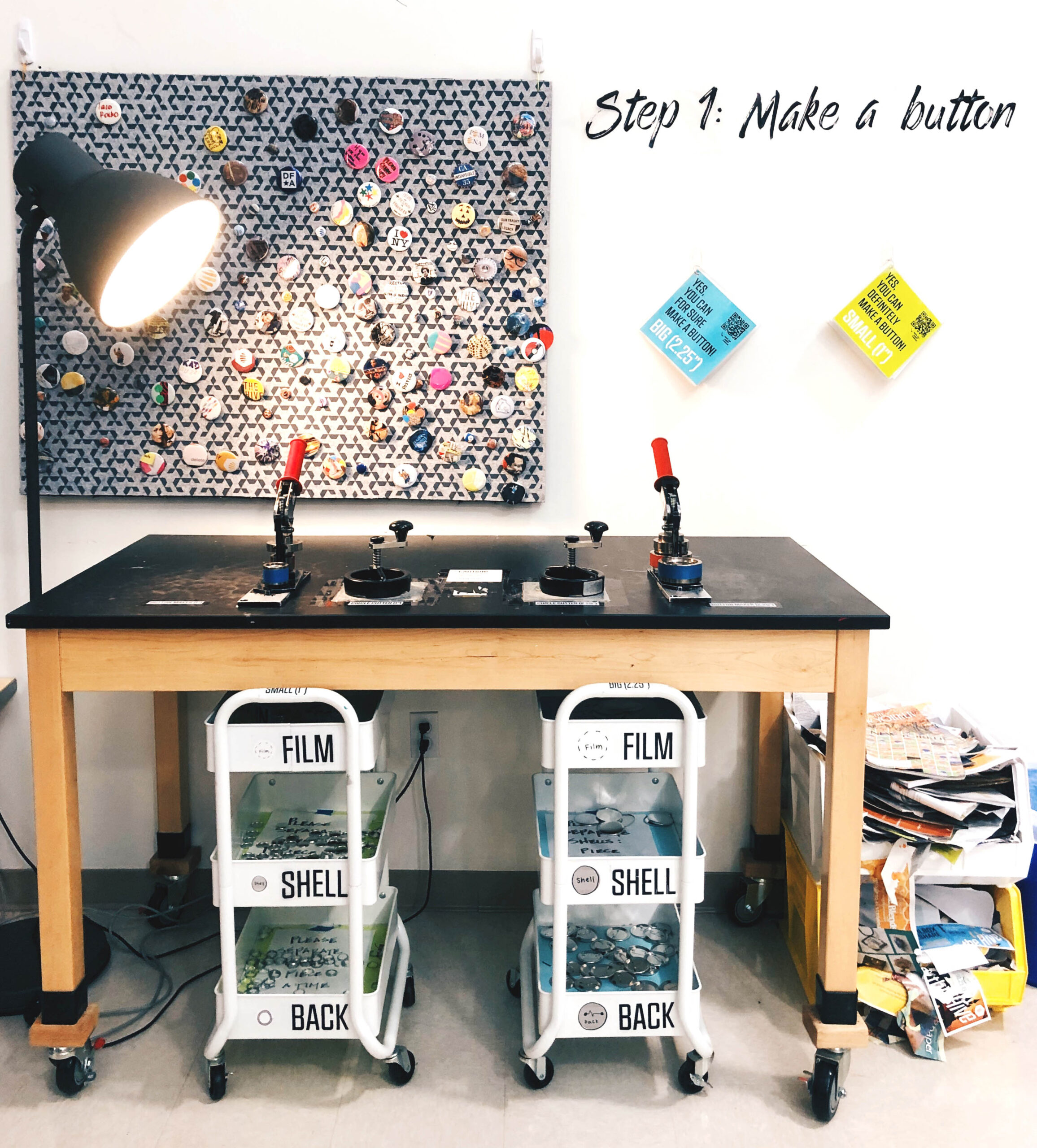
3. Button Making Station Instructions and Signage
One of the key features of the Hive is the button making station. It is a very easy first step into the world of creative confidence; you follow a few simple steps and can create a polished, usable, button. Students naturally gravitate towards the station and immediately want to start creating. However, because of unclear instructions on how to use the tools, users were often stuck, confused, and discouraged. My role was to redesign the usability of the space through informational signage from idea to implementation.
We started by identitfying the different pain points of the current button station. Our goal is for users to come feeling welcomed and leave feeling empowered. From our research, and testing, we redesigned three components of the experience:
1. Clear and inviting instructions for button making in two sizes
2. Easy system to collect the right materials for each size button
3. Clear signage on which matierlas and tools to use together
The new design includes step-by-step instructions with illustrations for an approachable tone, color coordinated button material carts to easily differenciate between materals for different sized buttons, and consistent labels for all tools and materials to minimize confusion.
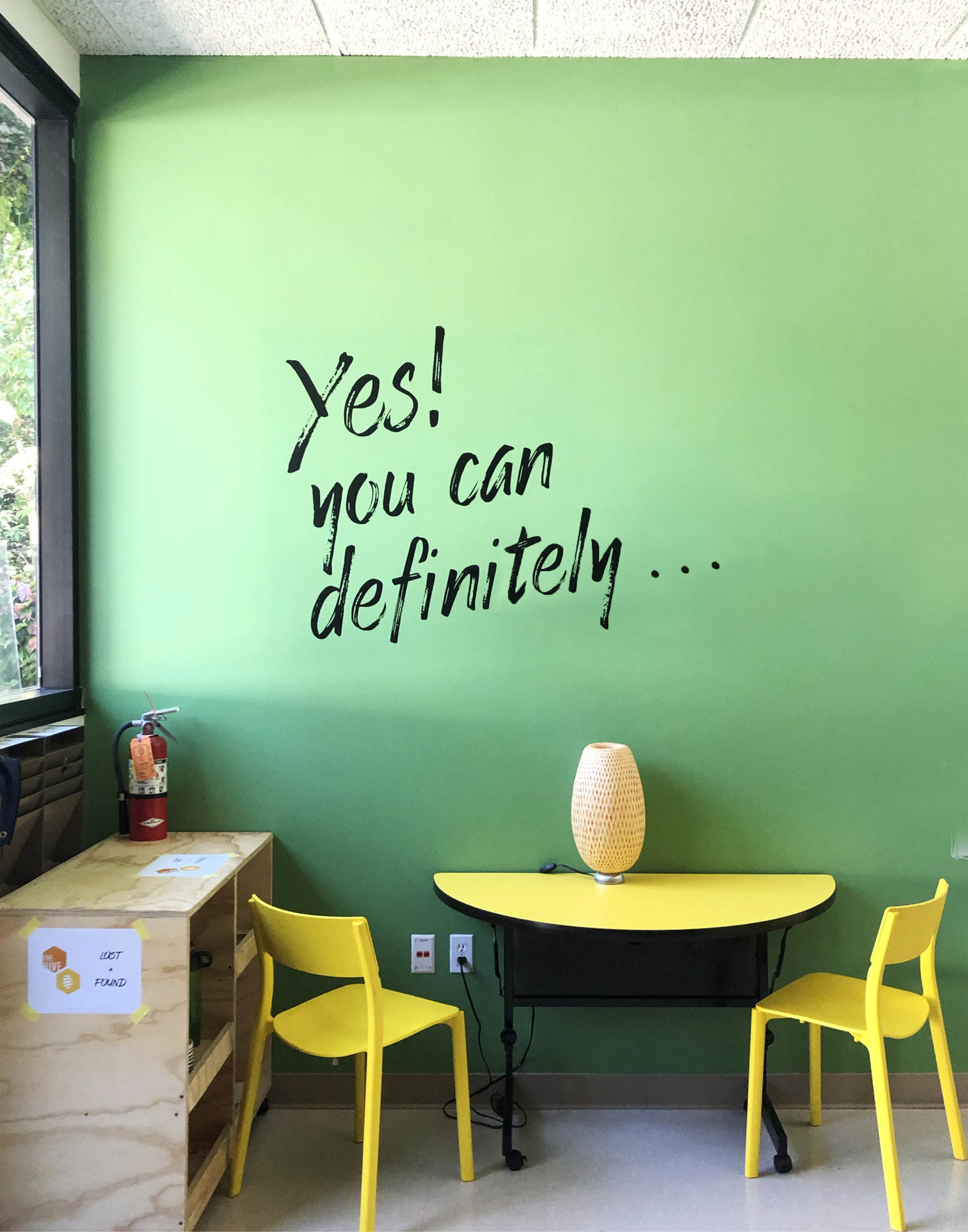
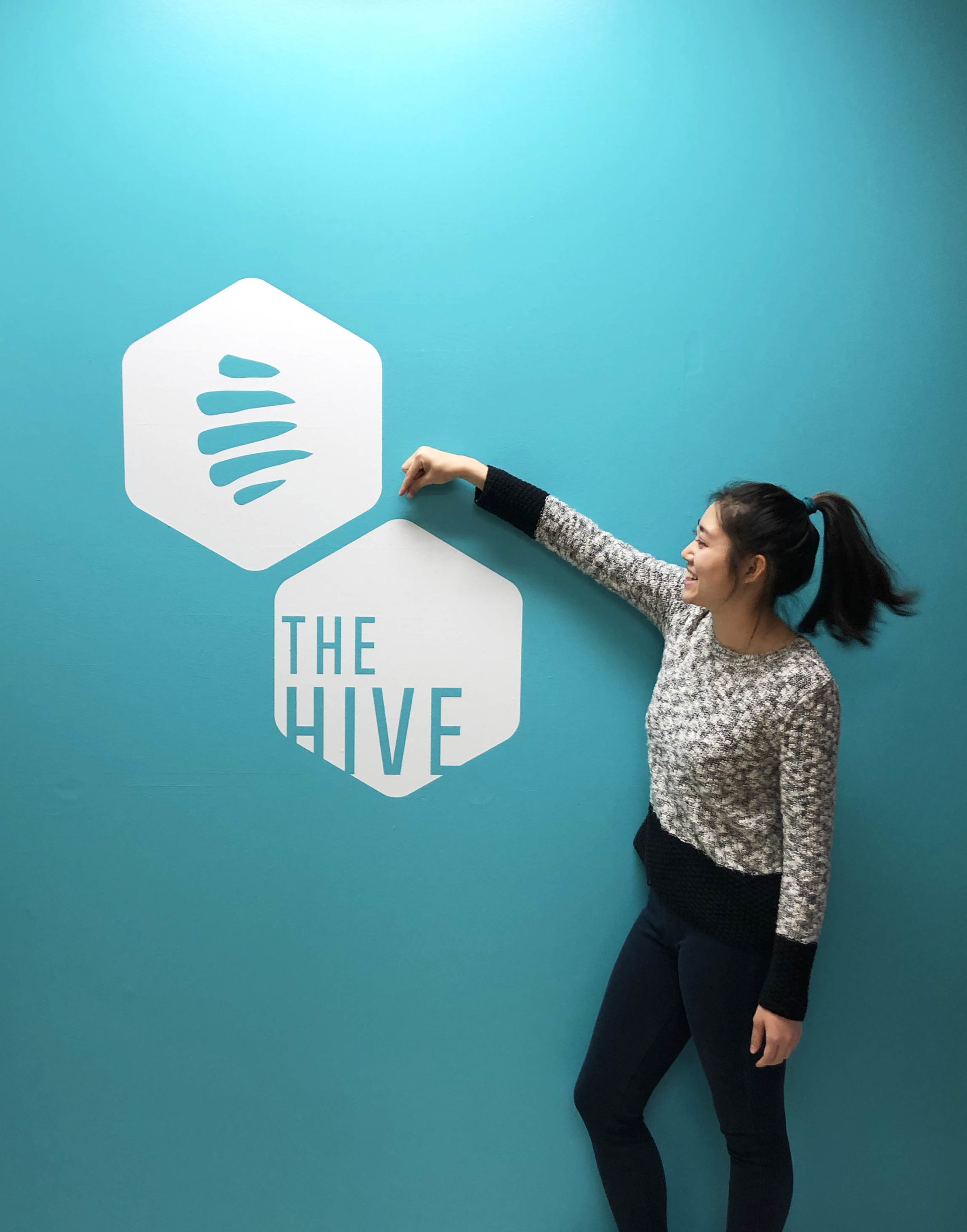
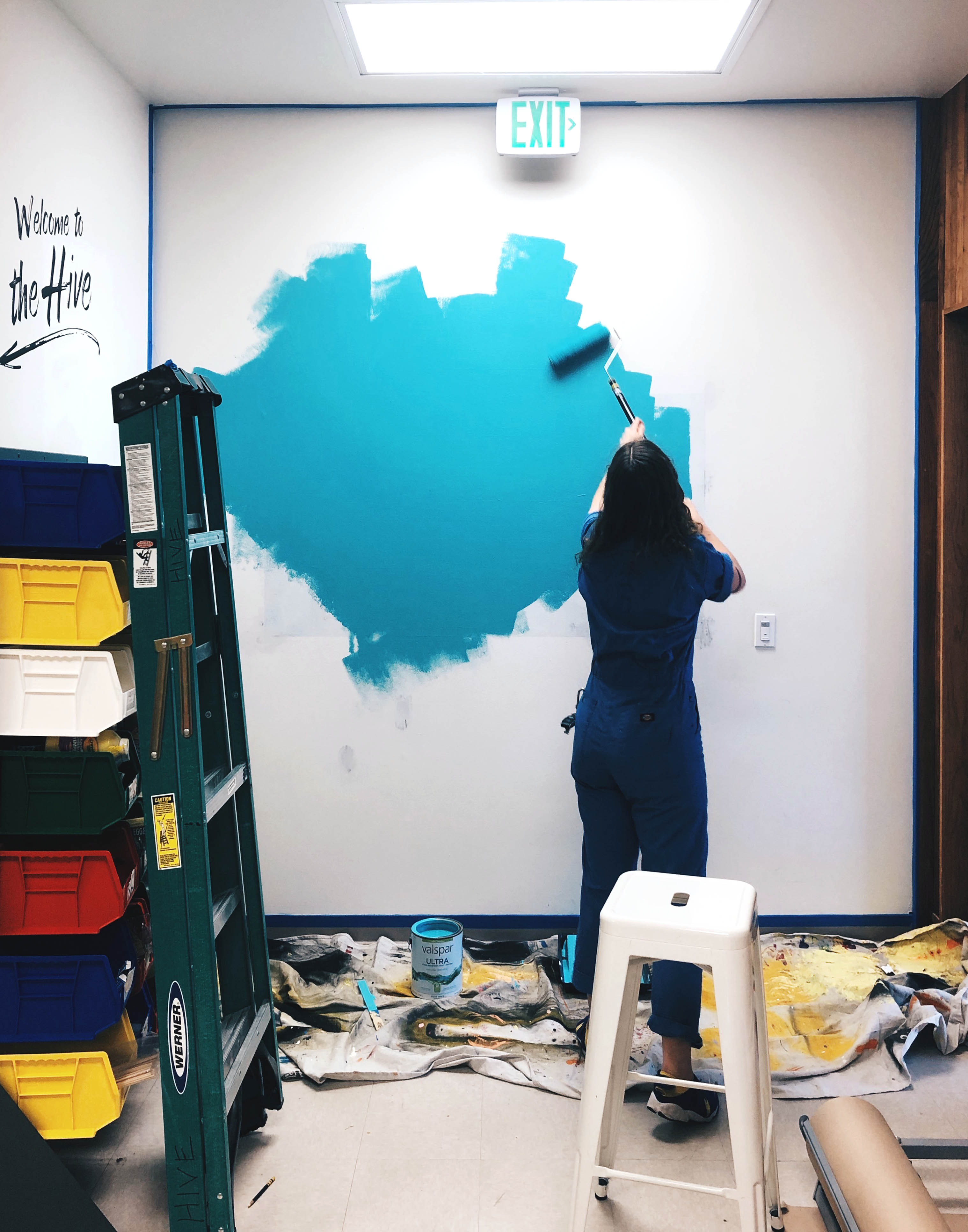
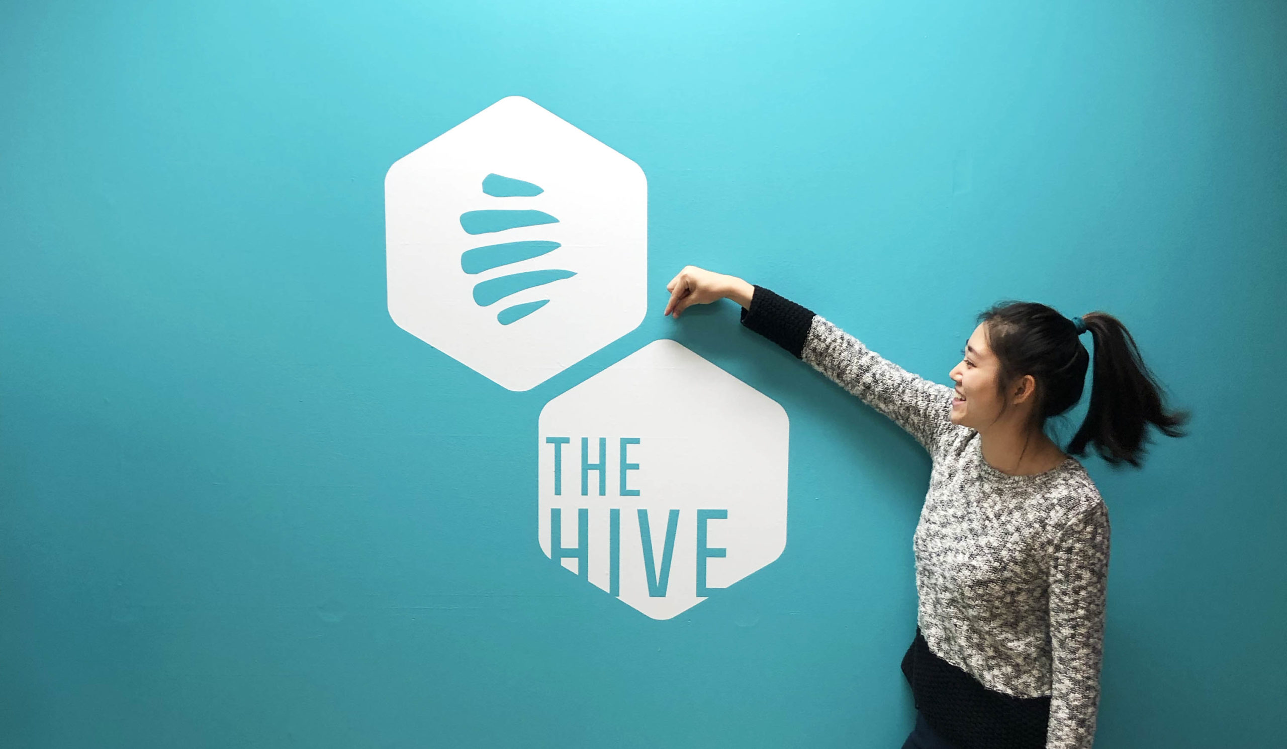
4. Wall Design
To create a more welcoming and vibrant space that reflected the Hive's ideals and mission, I designed three different walls to encourage interaction and excitement.
The Hive's slogan, "Yes! You can definitly", is featured right by the entrance, setting the tone and mentality for the entire space as you walk in.
The blue wall features the Hive’s logo, giving the space a professional and fun look. Both of these are designed and vinyl cut in house!