. MATH TYPOGRAPHY .
VISUAL DESIGN
ABOUT
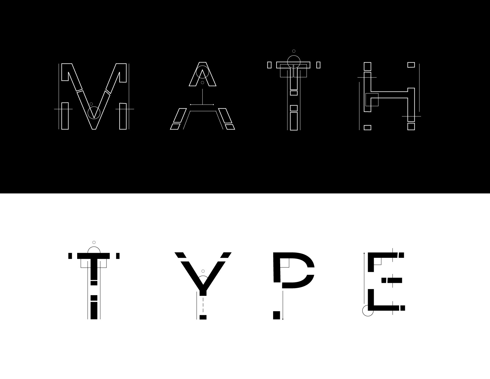
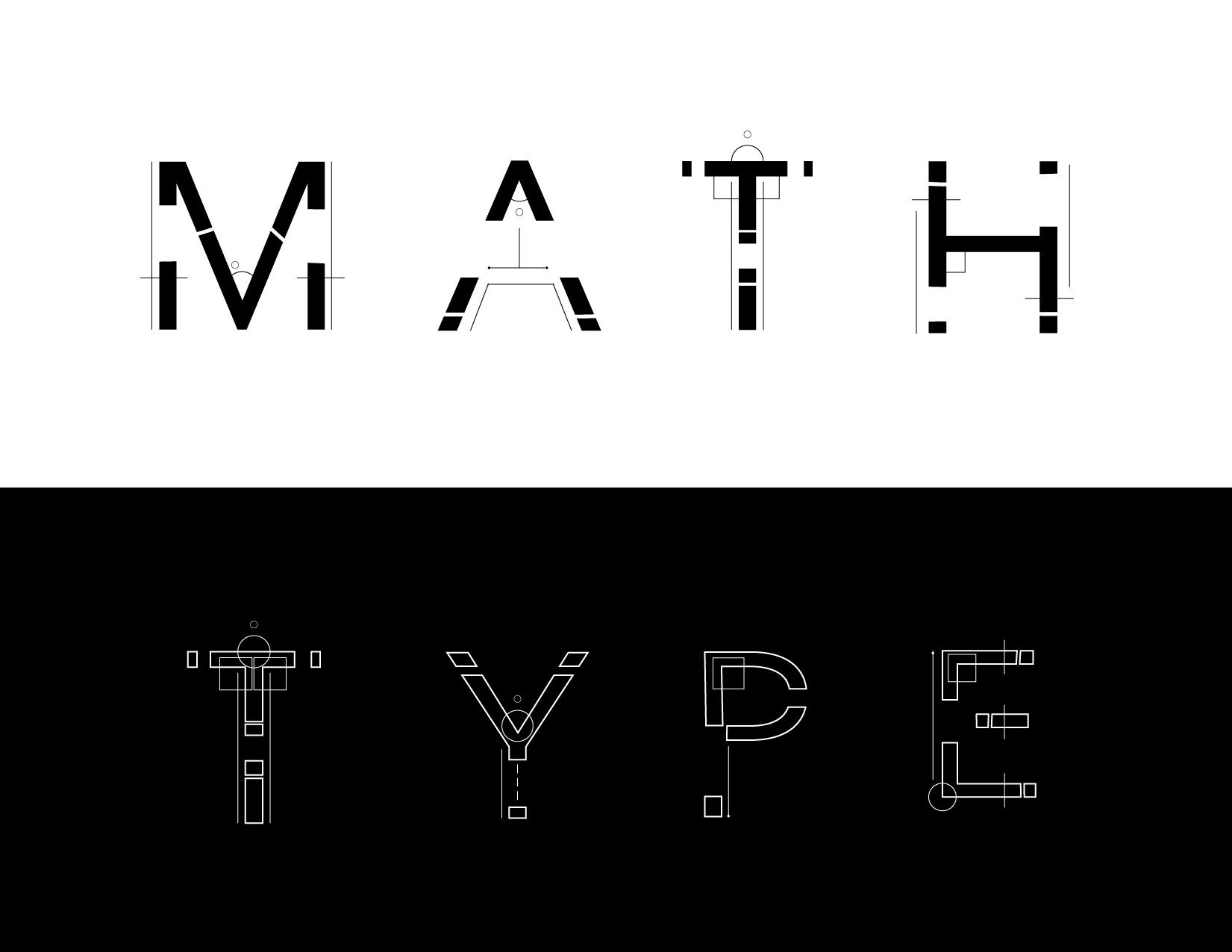
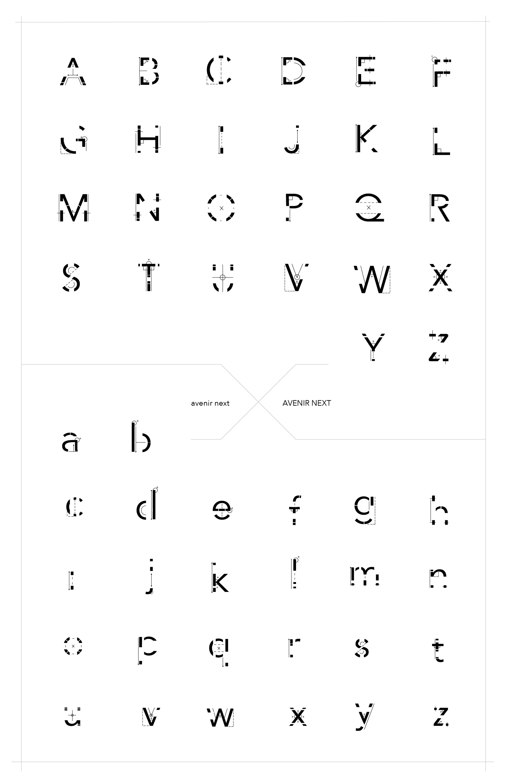
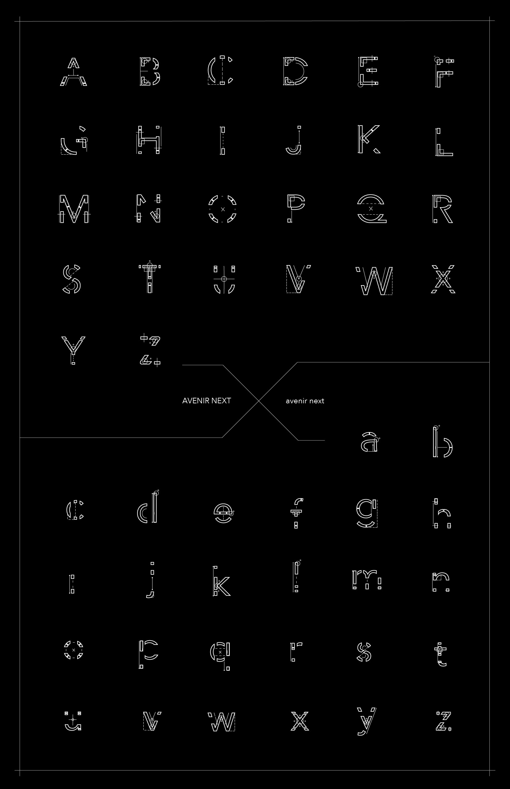
I designed this typography set utilizing visuals drawing from geometry. In this typeface, you can find continuous lines, line segments, angles, perpendicular angles, invisible angles, right angles, distance, and center points. I personally love typography and hate math, so I intentionally paired the two together to develop an aspect of math that I did enjoy: the visual elements. This typeface was designed by altering the capital and lowercase letters of the existing font, Avenir Next.
This type showcases clean lines in varying weights. This gives the overall typeface an unfinished “sketched” look, while still being dense enough to read. This typeface is suitable for depicting process oriented ideas and should be used in either a clean/minimal environment (to highlight the details) or in an environment/background that accentuates its unfinished/sketched look.
