EXPEDIA TRIPS
Streamlining trip planning for primary planners
ROLES
UX Researcher
PROJECT TYPE
Mobile web design
Client project
DURATION
10 Weeks
YEAR
2023
Overview
Client
Expedia Group is one of the world’s largest travel platforms allowing users to effortlessly plan their travels. They recently introduced the ability to save items to a "Trip" in an effort to simplify and ease the process of trip planning and organization. The Experience Design team was interested in gathering qualitative feedback from travelers to identify areas of confusion and ways to improve the new Trips experience.
Problem
The Trips team noticed there is a high drop off rate for users when discovering and proceeding to use the trips feature on their mobile web app, which is their primary platform for usage. They want to conduct usability research to identify areas of confusion and ways to improve the overall experience
Goals
Establish baseline usability data for Expedia’s Trips Experience on mobile web:
⍟ Evaluate the ease of creating a Trip and saving items
⍟ Identify points of friction and confusion in Trip creation and modification
⍟ Provide solutions to points of friction
Solution
⍟ Identified 4 usability issues that caused friction in user experiences with the trips feature
⍟ Suggested design solutions that improves the discovery, usability of the feature
⍟ Introduced additional tool that would support the usage of trips feature
Research
Research questions
1.
How easily and successfully do users discover the trips feature via the tab or heart icon
2.
How easily and successfully do users interact with Trips features? What obstacles prevent users from creating new Trips and/or finding their existing Trips?
3.
What are users’ goals with using Trips features? How well does the feature support these user goals?
Participant recruitment
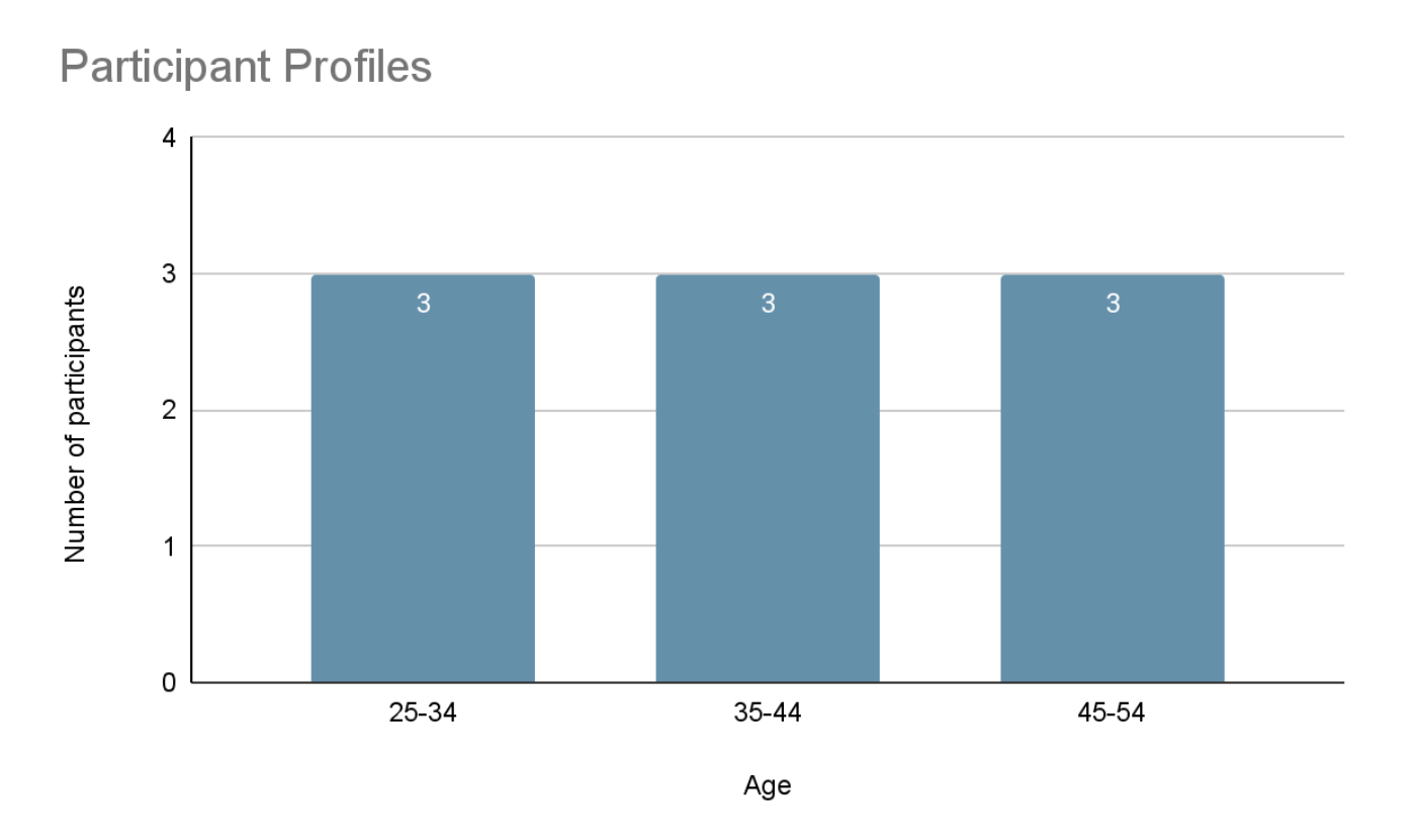
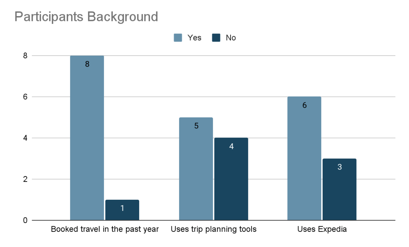
Working with stakeholders from Expedia, we defined the target study participant as someone who is primarily responsible for planning travel in their household and/or group and takes at least 2 leisure trips in a typical year (prior to the pandemic).
Partnering with User Research International (URI), we utilized a screening questionnaire to recruit a total of 9 participants who represented arange of traveler profiles across age, gender, occupations, experience using online travel platforms, and prior experience using Expedia.
Methodology
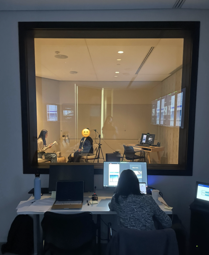
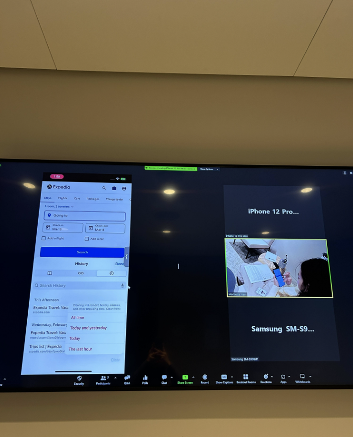
Based on the objectives and research questions, our team decided on a scenario-based, task-oriented approach for this study. Our team conducted these tests in-person in the research lab at Expedia HQ (Seattle, WA). We provided a mobile device (iOS or Android) for the participants and utilized an overhead camera system and Zoom's screenshare and recording functionalities to capture participants' interactions with the Trips features on mobile web.
✲
Scenario-based
task-oriented
Sessions included background interview, four scenarios with associated tasks, post-task questions, and a debrief interview. Each scenario was designed to observe how participants navigate and access different features and items within the Trips Experience.
✎
Quantitative and Qualitative Data
During each session, we collected qualitative data by applying the think-aloud method and conducting post task questions and debrief interviews. We collected quantitative data using a 5 point likert scale on ease of use and satisfaction
☺
In person moderated
60 minute sessions
We conducted these tests in-person at Expedia's research lab. We provided a mobile device (iOS or Android) for the participants and utilized an overhead camera system and Zoom's screenshare and recording to capture participants' interactions on mobile web.
Key task scenarios
1.
Planning a trip with friends. Find and keep track of 2-4 lodging options
2.
Find one or more kayaking options for your group to consider
3.
Share the trip they are planning with friends
4.
Compare and select one lodging to book from previous finds
Findings &
design decisions
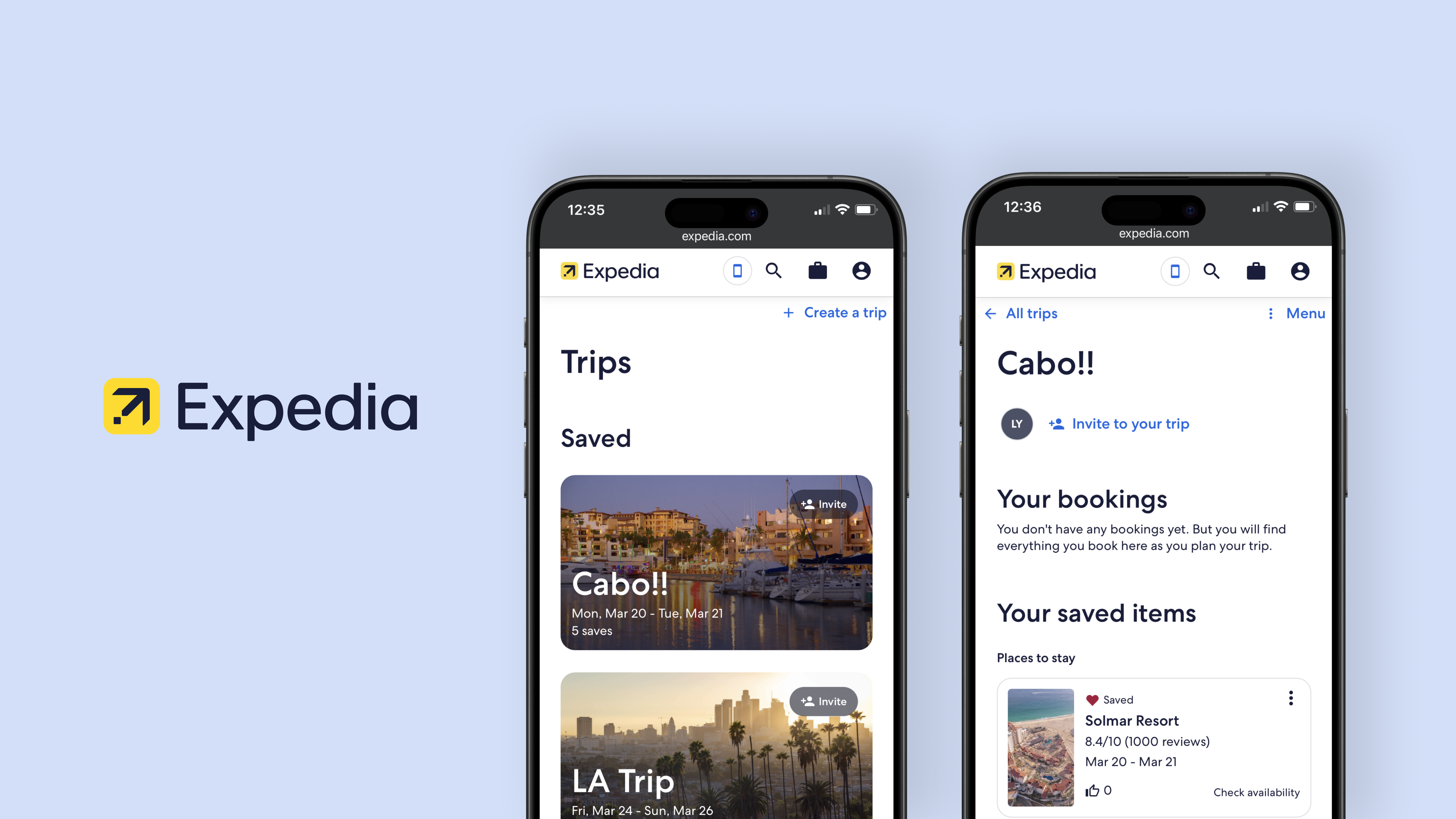
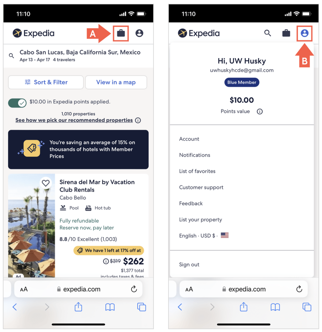
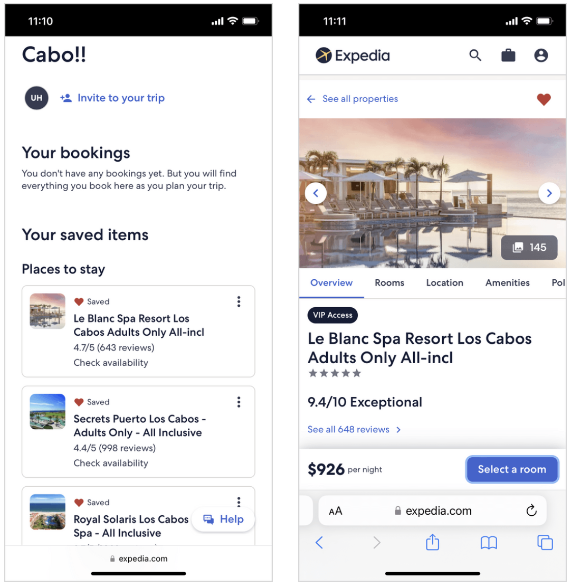
Issue 1: Users could not find their saved items
- 7 out of 8 users did not realize that the suitcase icon [A] represented Trips
- 6 out of 8 users assumed they would find their saved items in their profile [B]
-- "I figured I’d find my favorites in the profile area and list of favorites…I didn’t think of going to suitcase and seeing trips there.” – P5
-- "It took me a minute to interpret the suitcase as my trips since I normally see a shopping cart. I didn’t know at the time but just tried to click it.” – P7
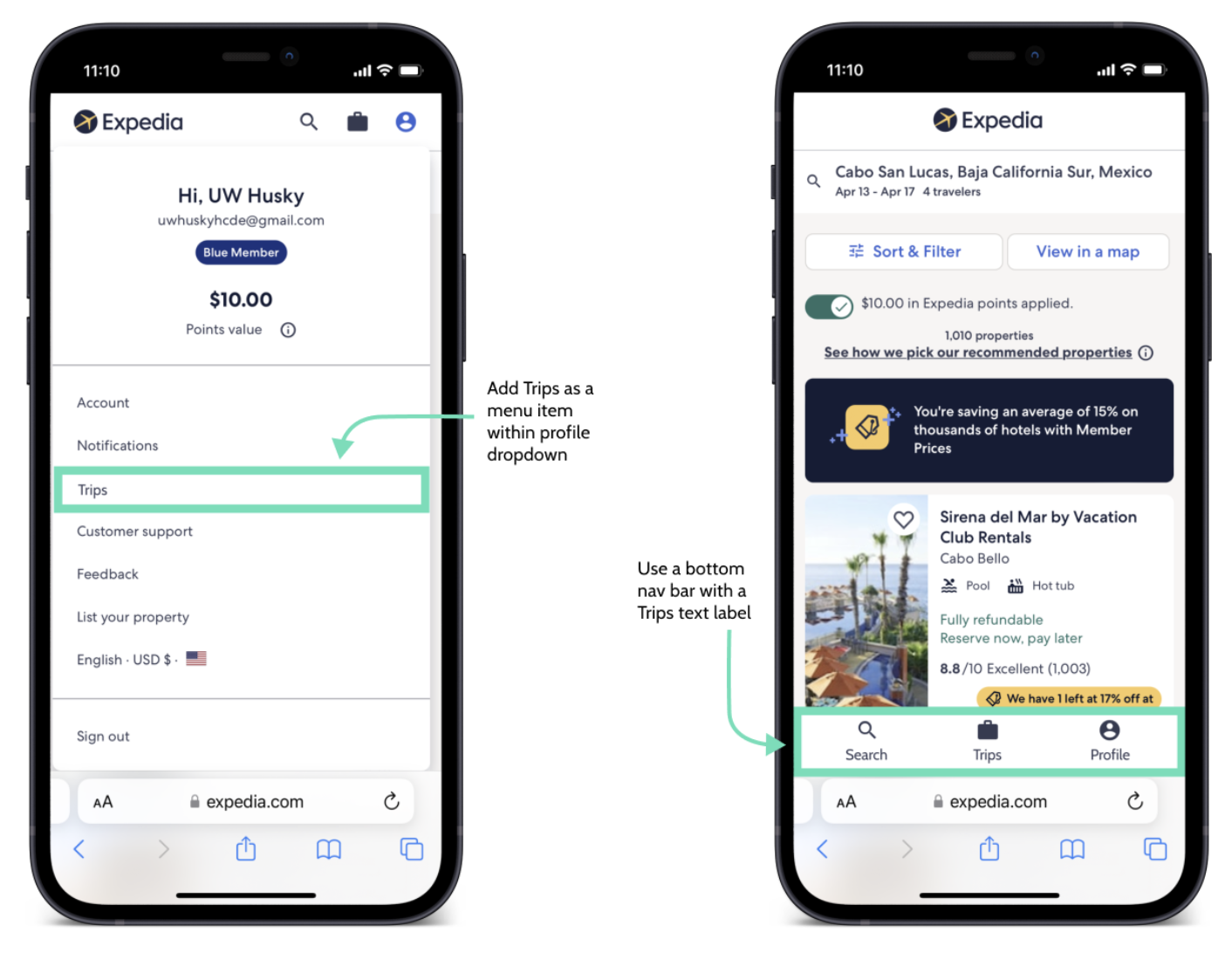
Design decisions
Increase the visibility of trips by:
✪ Including Trips as a menu item in the Profile dropdown
✪ Use the mobile app navigation bar, which includes a text label for the Trips icon, for mobile web
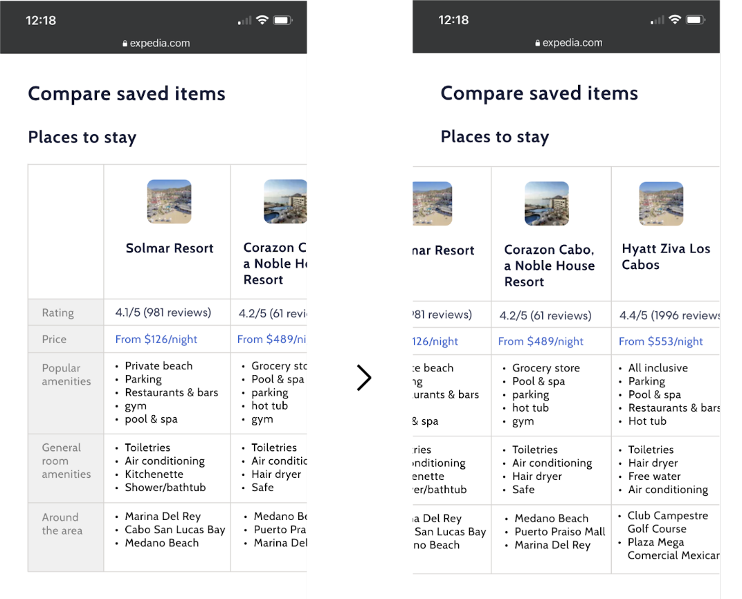
Issue 2: Difficulty comparing saved items
- 8 out of 8 users clicked in and out of the details pages for each of their saved items when trying to select one to book
- 3 out of 8 users expressed that going back and forth between pages caused friction
-- "I wonder if there's like a place where you can compare and contrast [saved items] like in a chart. But I doubt that, so I’ll just click on the first one… and I guess I have to do this manually in my head.” – P2
-- "It's more clicks than I would like. And then I just kind of have to remember where I was, and I have to back out.” – P3
Design decisions
Introduce tools and shortcuts that simplify the comparison process:
✪ Create a comparison tool that outlines the price, ratings, amenities, etc. of each saved item in one place
✪ Add an option to see the next saved item on the list from within the property / activity details page
✪ Ensure that the order in which the saved items are listed remains consistent
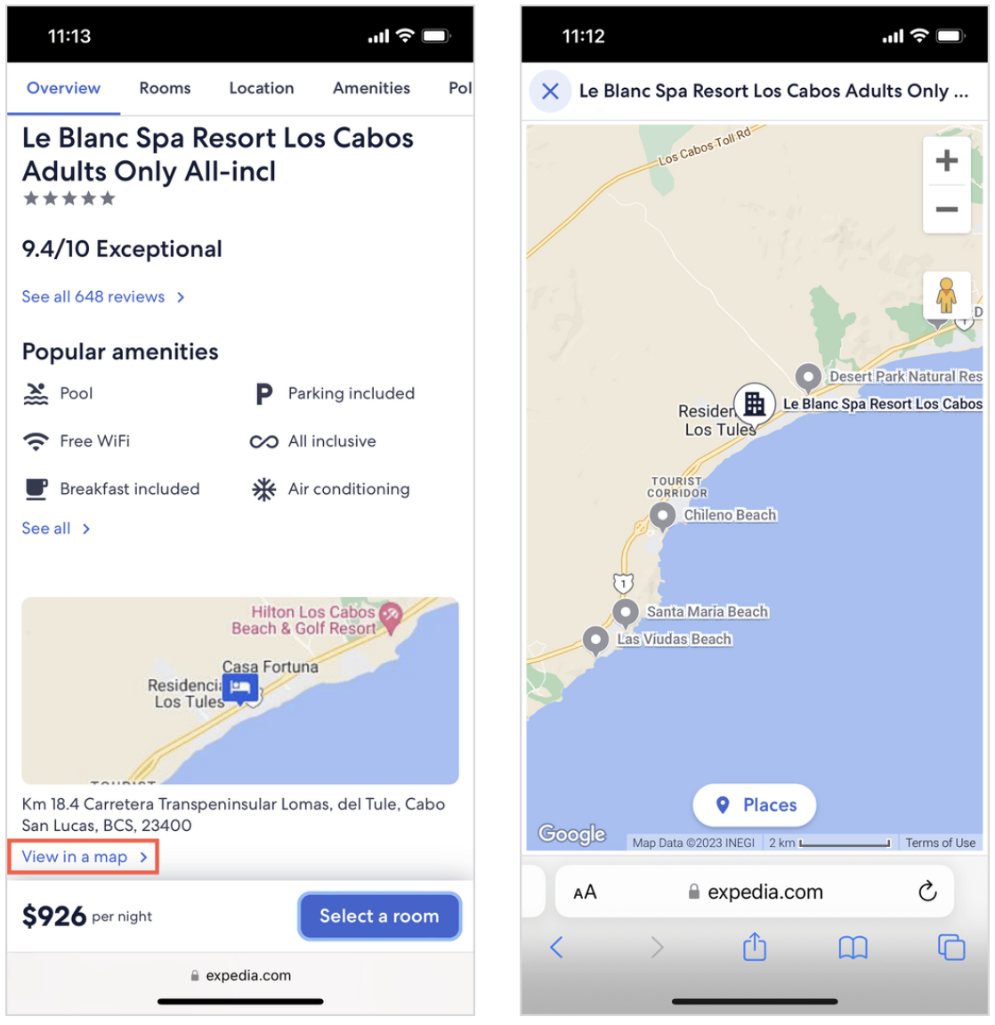
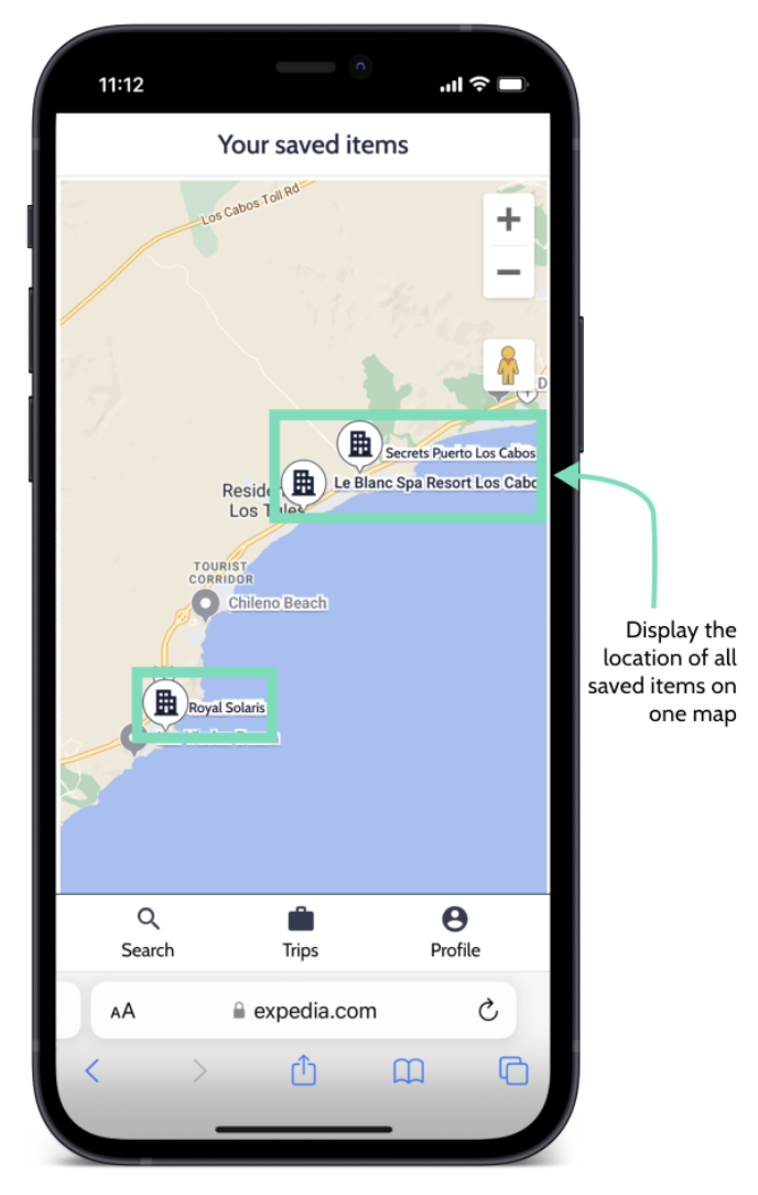
Issue 3: Unable to view locations on map
Users have to click into multiple separate maps to determine the location of their saved items.
- 5 out of 8 users clicked into the map within each details page when comparing items
- 2 out of 8 users explicitly stated they’d want to see one map with all of their saved items
-- "It looks like I just have to compare in some manual way. I thought there may be like a map where you could see all your different options.” – P2
-- "I was hoping to see all things saved on one map to compare proximity easier.” – P5
Design decisions
Allow users to see the location of all their saved items in one place
✪ Add a map that displays all of the different items that the user has saved to a Trip
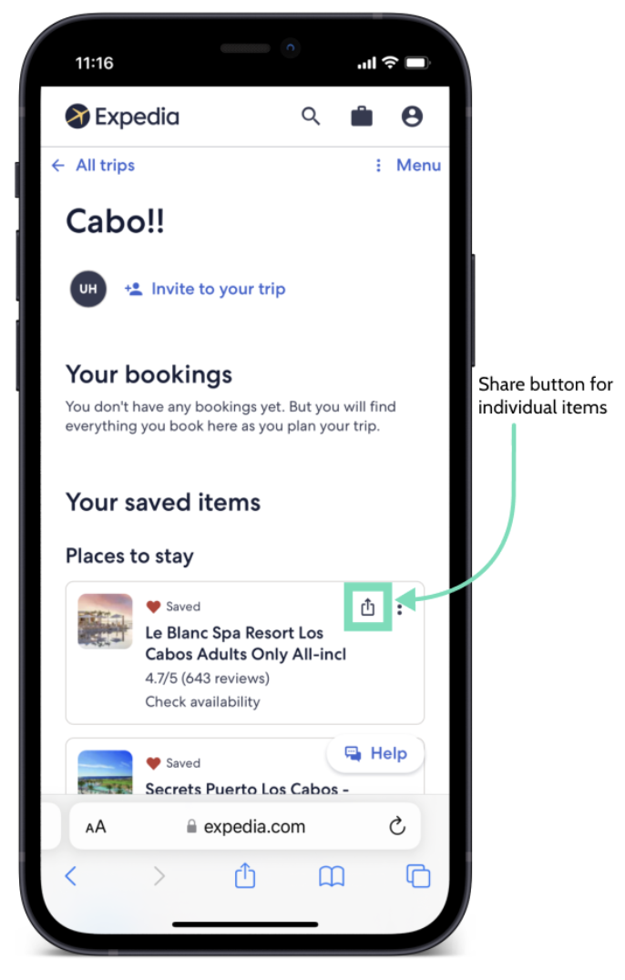
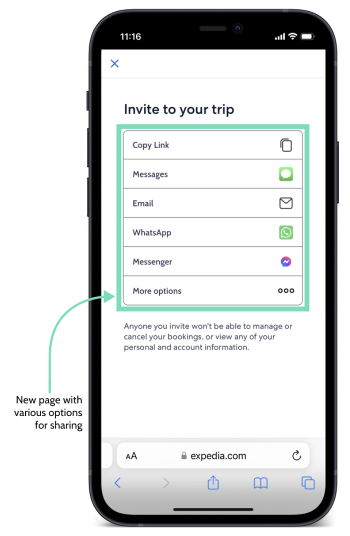
Issue 4: Could not share with friends
- 5 out of 8 users expressed that they typically share via texting and/or sending links
- 2 out of 8 users thought that the individual items saved in Trips would be shareable
-- “I don’t have email addresses for my friends, so I prefer to send texts.” – P3
-- “Seeing that I couldn't share my individual accommodations or activities shocked me a little bit. I need email addresses to share my trip which is a little more cumbersome than just sharing a link.” – P5
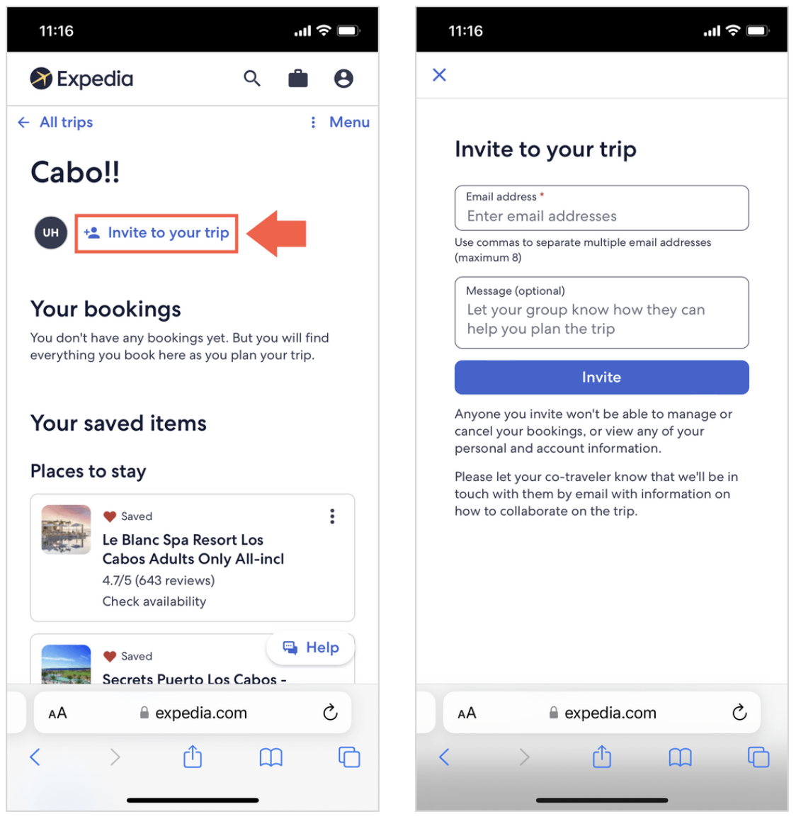
Design decisions
Include more options for sharing:
✪ Add a share icon to each of the cards under “Your saved items” to allow sharing of individual options for lodging, activities, etc.
✪ Create a page with different sharing channels such as SMS, copy link, etc.
Reflection
Impact
My team and I delivered a final report of usability testing findings and presented our design recommendations and solution mockups to Expedia’s Trips team and their greater design org. Our work received very positive feedback and recognition from the director of UX Research and senior design managers in attendance, who shared that the learnings from this project will help inform future improvements for Expedia's mobile web Trips experience.
Words from our client
Over the past 3 months, I've had the pleasure to work with Marianna, Lily, Patrice, and Tina on a class project to evaluate Expedia's Trips Experience. The goal of this study was the uncover any issues and identify areas of improvement with our live site, specifically on the mobile web platform. Even early on, the team exemplified qualities of strong UX Research - working collaboratively to understand the problem space and defining the research plan. Over the course of the next few weeks, the team conducted in-person moderated study sessions in our research labs. They were prepared, organized, made participants feel comfortable, and showed a great deal of professionalism throughout the sessions. In addition to providing us with a comprehensive research report, the team presented their findings in a very engaging manner to Expedia's stakeholders, and they took this one step further by coming up with design solutions for their recommendations. Both myself and my team were extremely impressed by not just the output of the work, but with how the team went about conducting this project from start to finish - especially for a group of students who are new to this field. The learnings from this project are going to be very helpful as we continue to explore ways to improve the Trips experience, as well as reinforce our qualitative understanding of the users' needs. Overall, the team has exceeded my expectations from this project, and I have no doubt that they are going to add tremendous value to any design team in the future."
– Rajiv Pennathur, UX Researcher at Expedia Group
Future research areas
Since we’ve identified the desire for a map that includes all saved items in one place as well as a comparison feature for travelers to easily see details across saved items, we’d recommend concept testing for these new features.
Another area of research is A/B testing with different icons for Trips. We identified that the suitcase icon is not currently identifiable as Trips and most travelers’ first reaction is to go to their profile to access their saved items. Testing various icons to assess their effectiveness would be useful.
Learnings
Since this was our first time moderating in this kind of setup and script , there were some inconsistencies with our probing questions and interview style when we went off script. It would be helpful to include more probing questions for different scenarios of the users engaging with the product (ie. if the users clicks on this, ask them to elaborate)
We may think about other note taking strategies to make the analysis process easier. We used Figjam and took notes on stickies, but it was difficult to then keep track of which quote belonged to which user and for which scenario/context they were talking about it in.