EVERGREEN AVIAN & EXOTIC ANIMAL HOSPITAL
Reimagining the website experience for Evergreen Avian & Exotic Pet Hospital.
ROLES
UX Design Lead
Project Manager
PROJECT TYPE
Web design
UX/UI design
DURATION
10 Weeks
YEAR
2023
Overview
Client
Evergreen Avian and Exotic Animal Hospital is a non-corporate, family-owned veterinary care provider specializing in high-quality care for small companion exotic animals and birds including parrots, ferrets, rabbits, lizards and more across their 2 locations in Seattle and Kirkland
Problem
On a typical day, the hospital receives over 100 client calls about services they offer, requests for appointments, visitation forms, and general pet care information. This high call volume negatively impacts the reception workflow and customer experience before and during a visit. Much of the information their clients are calling about can be found on their website, however, it is currently underutilized with a bounce rate of 50% (leaving without clicking any other page). Thus, the hospital decided to request a redesign of their website.
Goals
Business goals
Minimize incoming calls by 20% and prioritize outgoing calls
Decrease average non-appointment time spent by each customer at the hospital by 20%
Usability Goals
Decrease website bounce rate by 25%
Reduce time on task by 15%
Branding goals
Create a visual identity that feels welcoming, inclusive, and professional
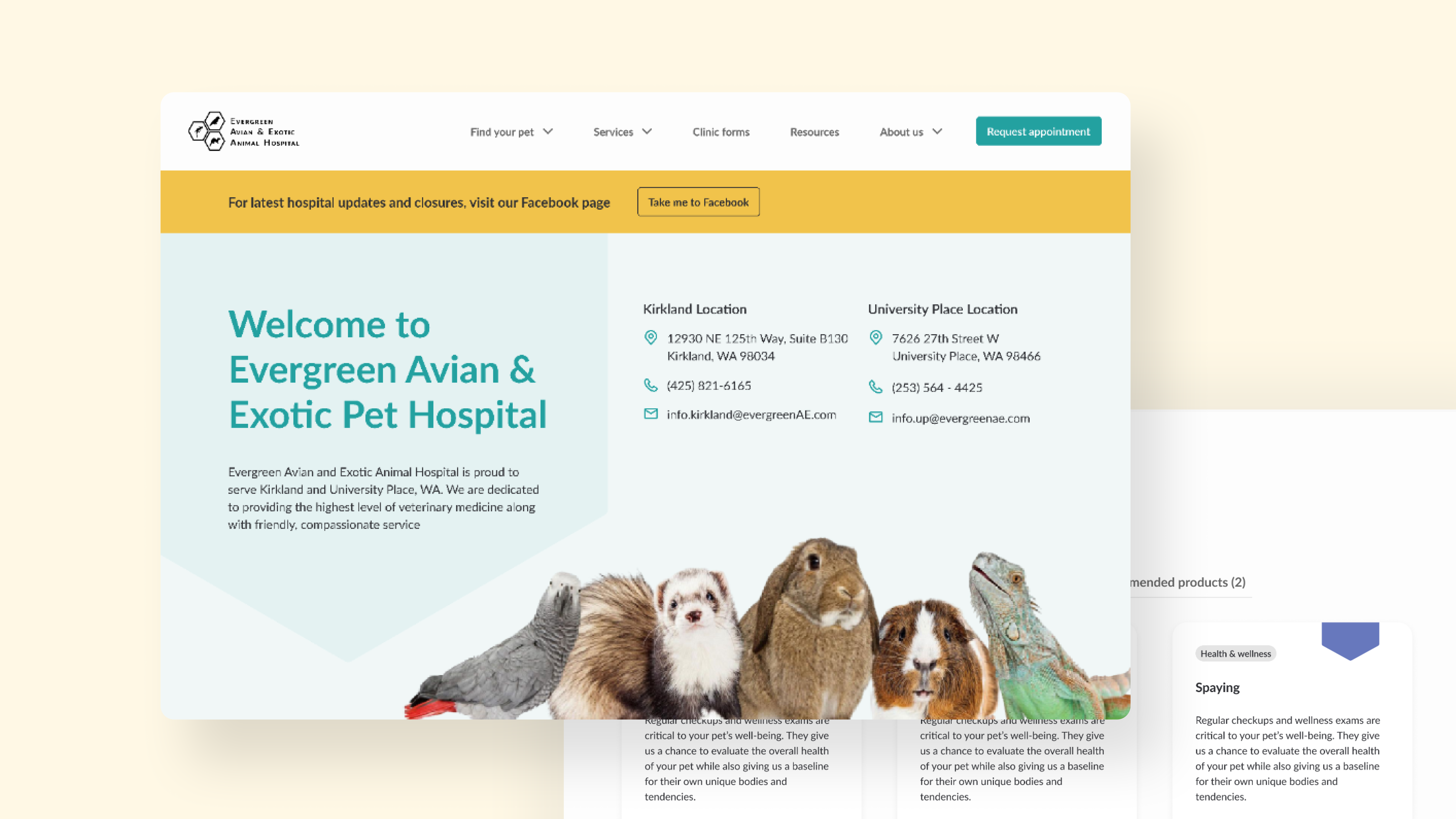
Solution
We used 10 weeks to complete the redesign, from understand our client's needs, defining success metrics, conducting qualitative and quantitative research to strategize goals, to creating a complete design system of the new design.
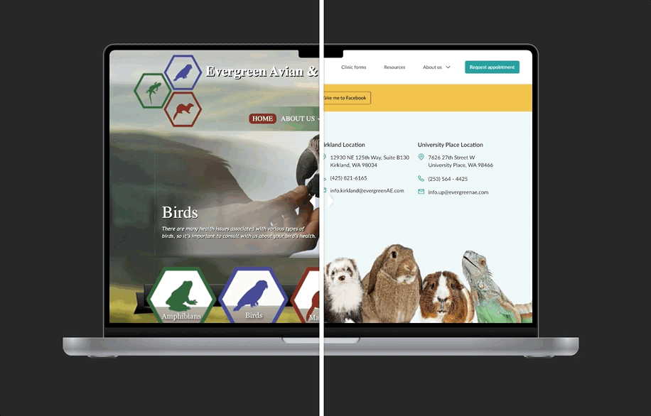
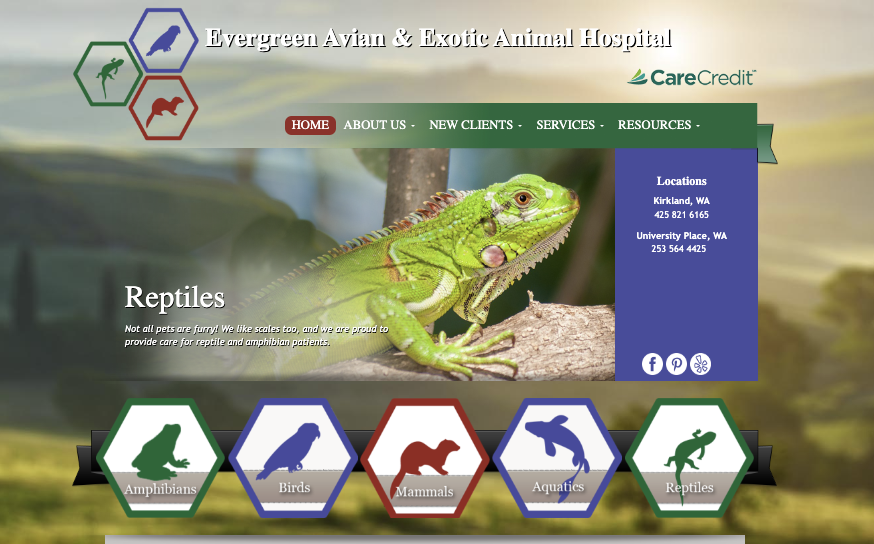
Before
After
Research
Research methods
☎
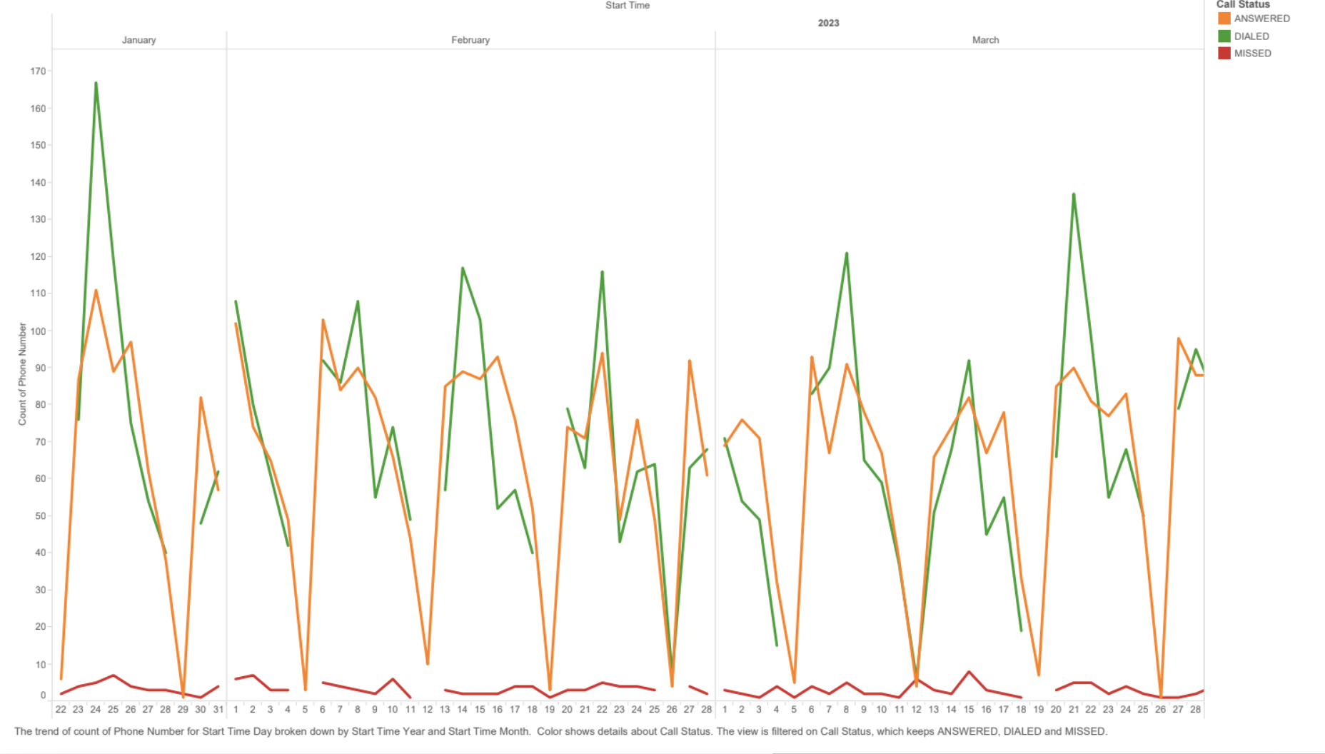
Customer call data
Analyzed three months of customer call data including call time, frequency, and duration. Conducted two 30 minute interviews with front desk staff on call content
✎
Website analytics
Reviewed last 6 months of website analytics to understand which pages users are experiencing friction and dropping off
❞
Usability evaluation
Conducted four 50-minute semi-structured usability test of the current website to explore friction and pain points
☷
Quantitative research
Created and distributed a survey to understand existing user’s experience with vet hospitals
General insights
80%
Users called in and asked for information that could be found on the website
100%
Could not find the information they were looking for (ie. insurance, vet details)
100%
Users were confused about how to book an appointment
50%
Users did not engage with the website past the landing page
Pain points
1.
Can’t find the information they need
-- “I don’t really care about other species types, I just need to fine mine”
The website’s information architecture does not work for a hospital serving so many different types of animals
For example, hamster owners would need to know what animal family their species falls under and locate the page for it. Even then, there is no specific information about what is offered for that particular species
2.
Unable to perform key tasks
-- ““How can I make an appointment if I decide to go?”
The website’s information architecture does not work for a hospital serving so many different types of animals
For example, hamster owners would need to know what animal family their species falls under and locate the page for it. Even then, there is no specific information about what is offered for that particular species
3.
Outdated visuals feel chaotic and unwelcoming for new users
-- “This is a little chaotic and old, it probably reflects the clinic as well.”
The website visual and informational hierarchy make the viewing and navigation experience chaotic which deters users from wanting to explore
For example, the prominent use of various colors and type styles makes it overwhelming to make sense of the information displayed
Ideation
Design goals
Improve information hierarchy
Create an information architecture that matches user’s mental models to help them find information efficiently.
Increase key task usability
Allow users to accomplish their goals easily, quickly and pleasantly while establish proficiency
Establish visual system that matches mission
Create a visual system that matches the mission and values of Evergreen Exotic Animal Hospital
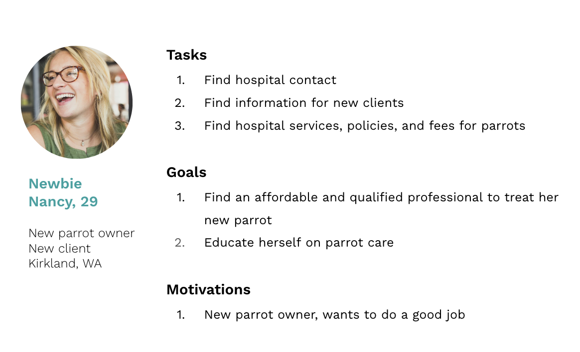
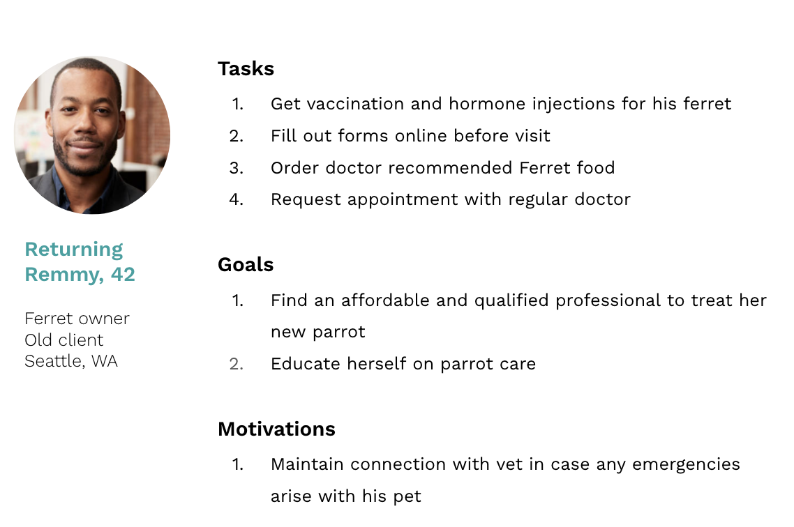
Target users
From our interviews with front desk staff, most people calling are either new clients or returning clients who have different needs
New client
focus is on discovery of services and information about their animal
Returning client
focus is on booking appointments
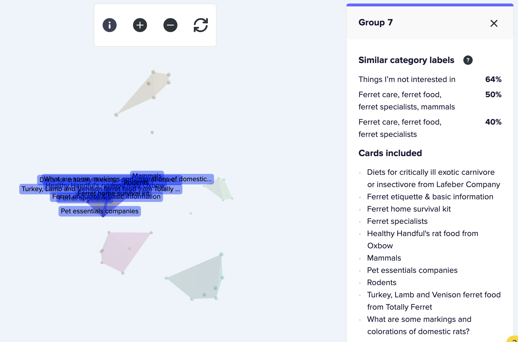
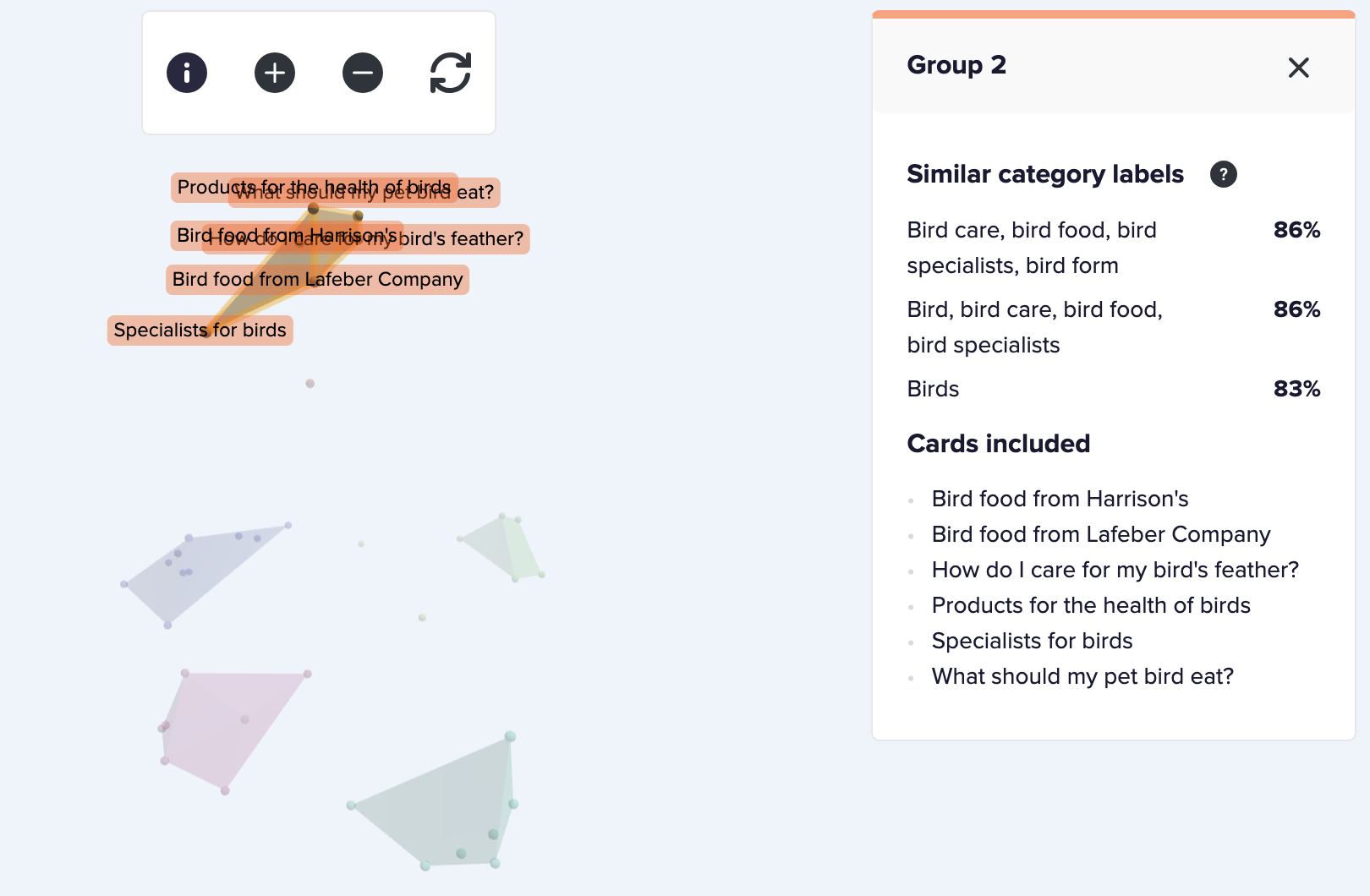
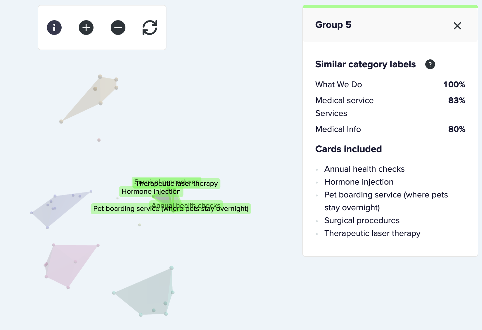
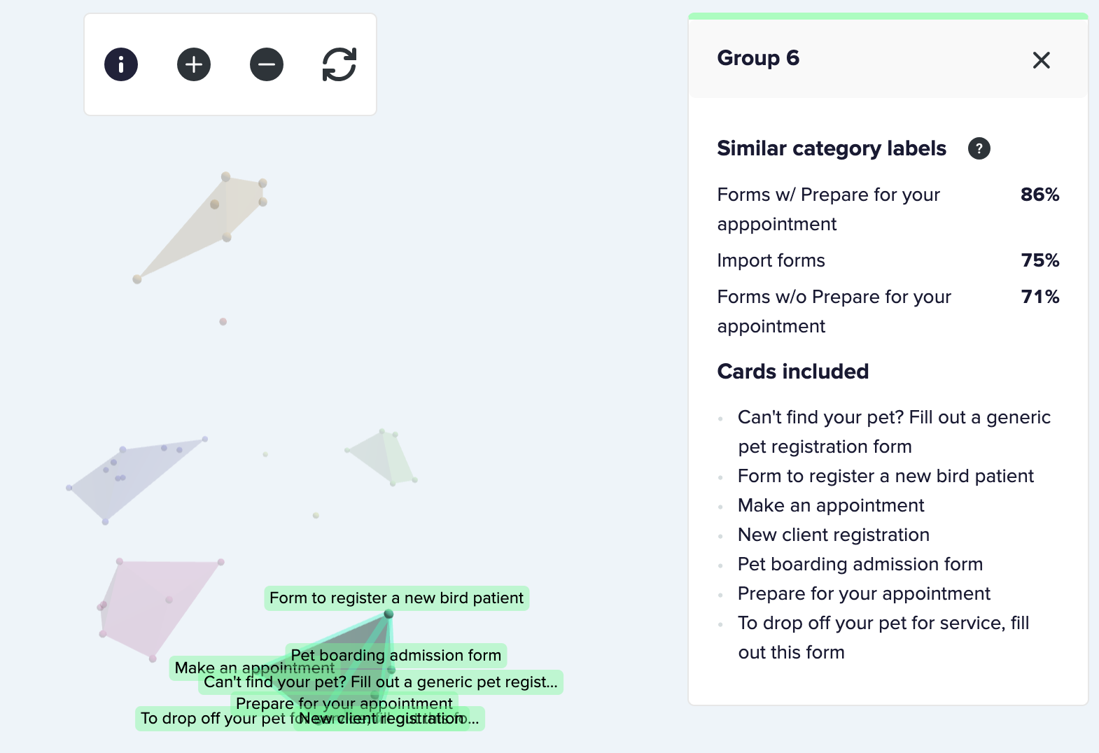
Card sort
We conducted an open unmoderated digital card sorting exercise with 15 users to create an information architecture that best matches users’ mental models
💡
Major finding: Users strongly associated services, pet guides, and specialists with each animal type rather than by resource categories
For example: Parrot services, parrot care guides, bird specialist, and parakeet information were grouped together under birds. This is very different to how the site is currently organized, which is by information type (all services offered by the clinic regardless of animal type, all pet care information regardless of animal type)
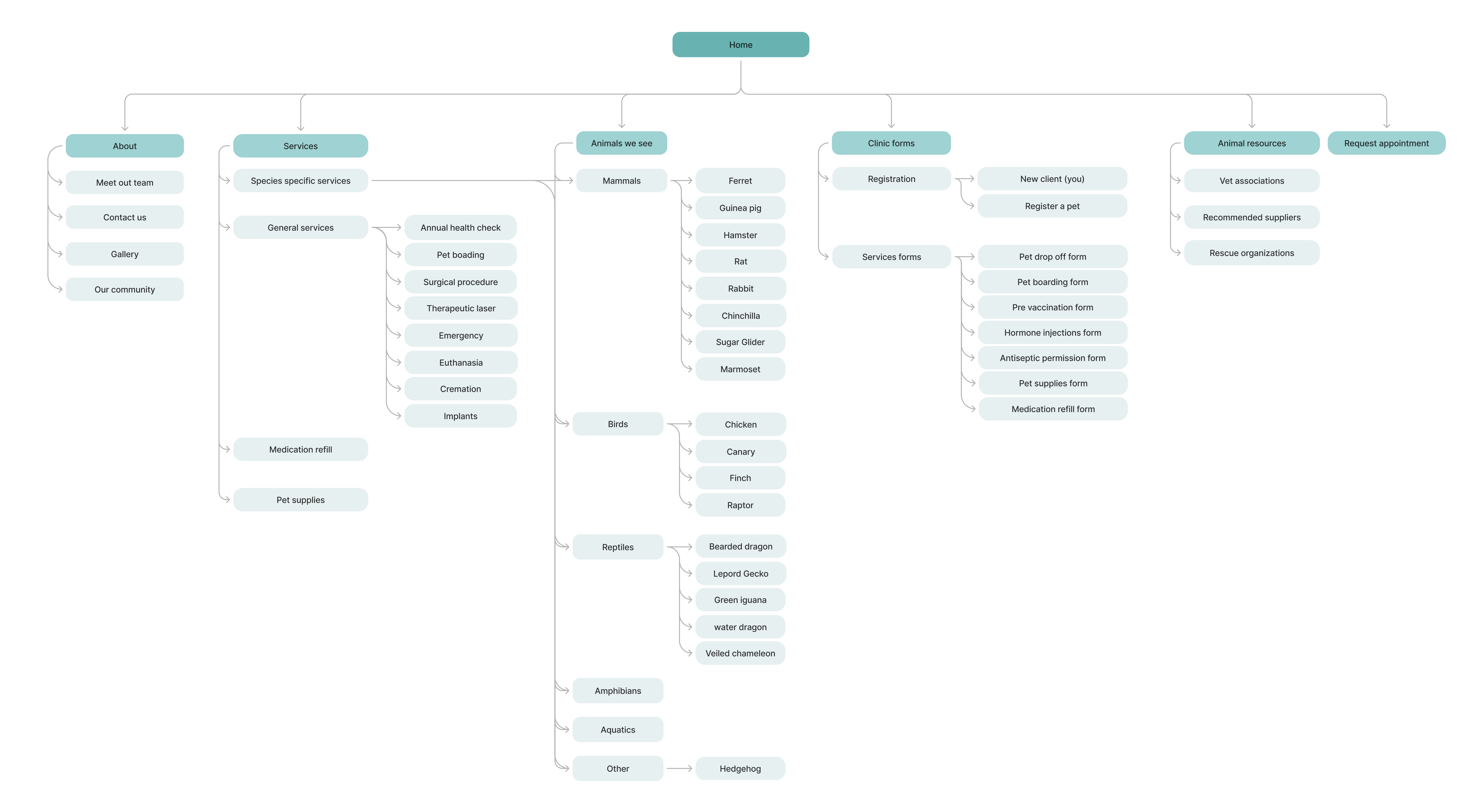
Information Architecture
We used our results from our card sorting to create an IA that shows the underlying organization and structure of the website.
Paper prototype
Each of us created a paper prototype based on user research, and then came together as a group to discuss different variations and possibilities of our prototypes. We also researched existing design patterns of our design elements.
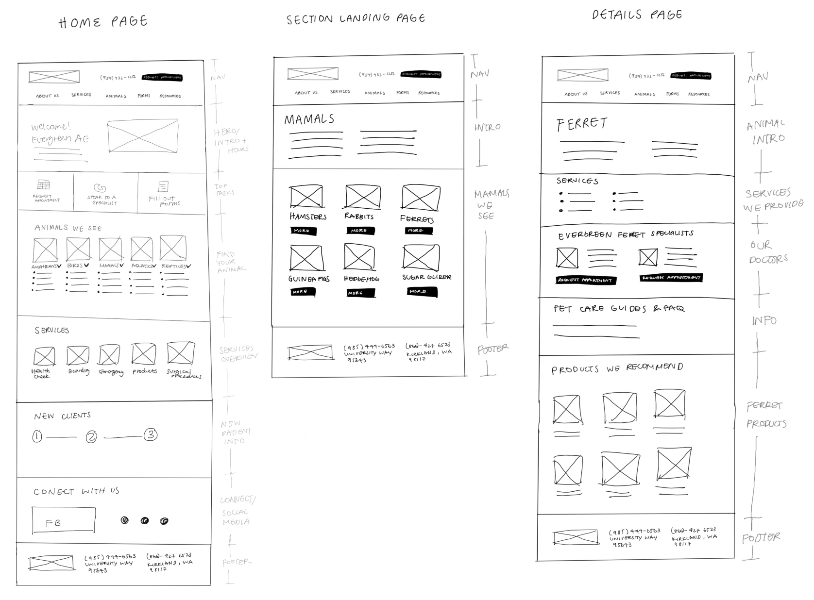
Mid fidelity wireframes
We then combined our insights and feedback from our paper prototype and created mid-fi wireframes using Figma.
Iteration
Usability test
After creating the high-fidelity prototype based on feedback from our concept tests, we planned and conducted another usability testing session with 3 participants focusing on the overall flow and usability of the prototype.
1. We incorporated a progress bar in home page to guide the participant in the appointment booking process. However the participants found it confusing because we only covered steps prior to visit and they wanted to see the whole journey of their experience including visiting the hospital.
2. Users found some labels confusing. For example, users were not sure what the button labeled ‘find my animal’ referred to.
3. Some users suggested the incorporation of patient profiles that would allow returning patients to log in, see their records, and request appointments based on previous visits. However, this feature is out of scope for our design team and for the website platform the client is using.
Visual design approach
We created a branding survey and sent it to our stakeholders to understand how our users think and feel about the brand. We then analyzed all the results and developed 3 brand tenets and translated them into design translations to help inform decisions in the design process.
Brand tenet 1: Inclusive
Evergreen Exotic Animal Vet Hospital provides equal access to all exotic animal species and their owners regardless of age, experience, or number of pets.
➞
Design translation:
- Attention to accessibility in navigation and alternative text
- Reduce cognitive load by using single font with varying weights
Brand tenet 2: Welcoming
Evergreen Exotic Animal Vet Hospital is a non-corporate, and family-owned business that promotes a welcoming community for their clients
➞
Design translation:
- Color categorization by animal type to add vibrance and organization
- Show real photos of animals and community
Brand tenet 3: Expert
Evergreen Exotic Animal Vet Hospital delivers the highest quality, professional care for small, companion exotic animals and birds
➞
Design translation:
- Use of geometric hexagon motif for consistency and structure
- Clean background with accent colors for simple and professional experience.
Design
After many iterations on the visual system with input from users and the client, we designed 15+ pages across the website to be used as templates for the rest of the site content.
Pain points addressed
1. Navigation by animal type
The previous website’s information architecture did not match users’s mental models which caused frustration in finding the information they needed
We used Card Sorting, Tree Testing, and flow maps to ensure clear navigation.
Features:
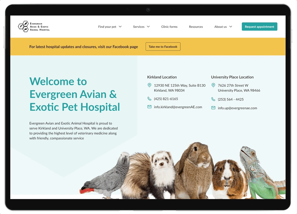
✪ Species focused information architecture
✪ Updated information on species and services
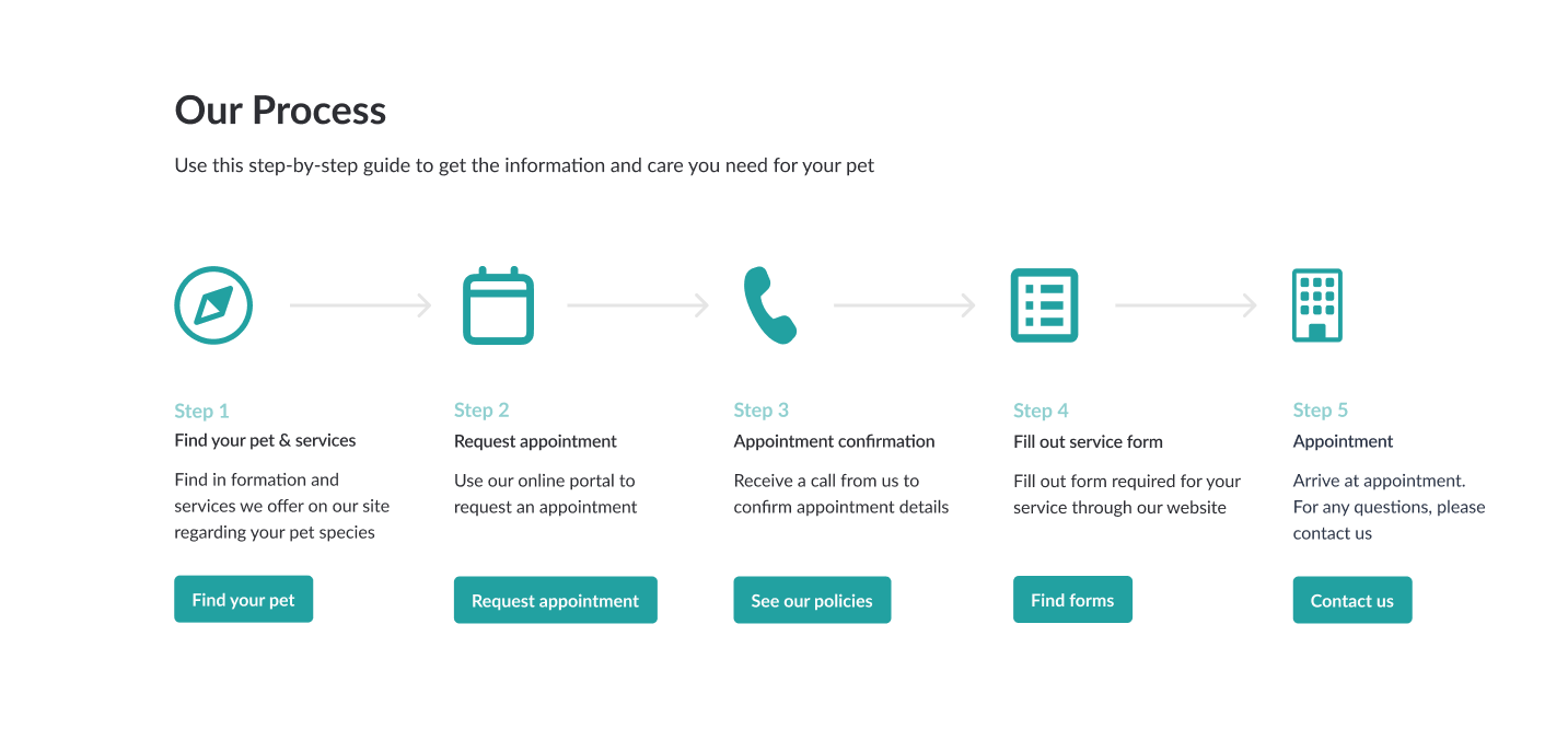
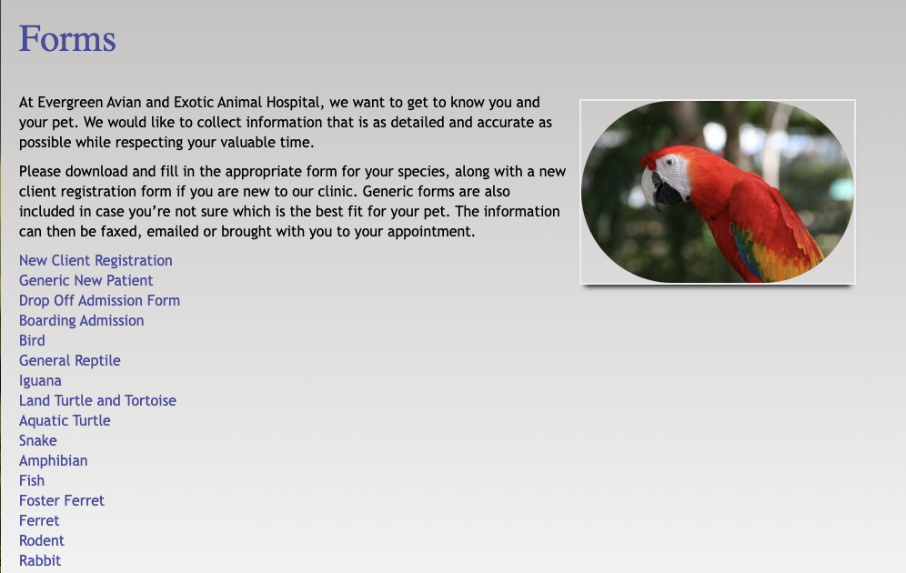
2. Step by step guide for actions
The previous website had no way to take action aside from calling
We added actionable items such as requesting and appointment and filling out forms online
Features:
✪ Step by step guide on the home page
✪ Clear paths and CTA
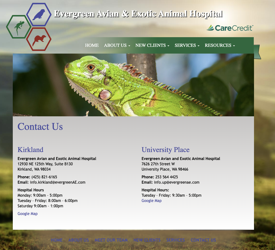
3. Updated information + look and feel
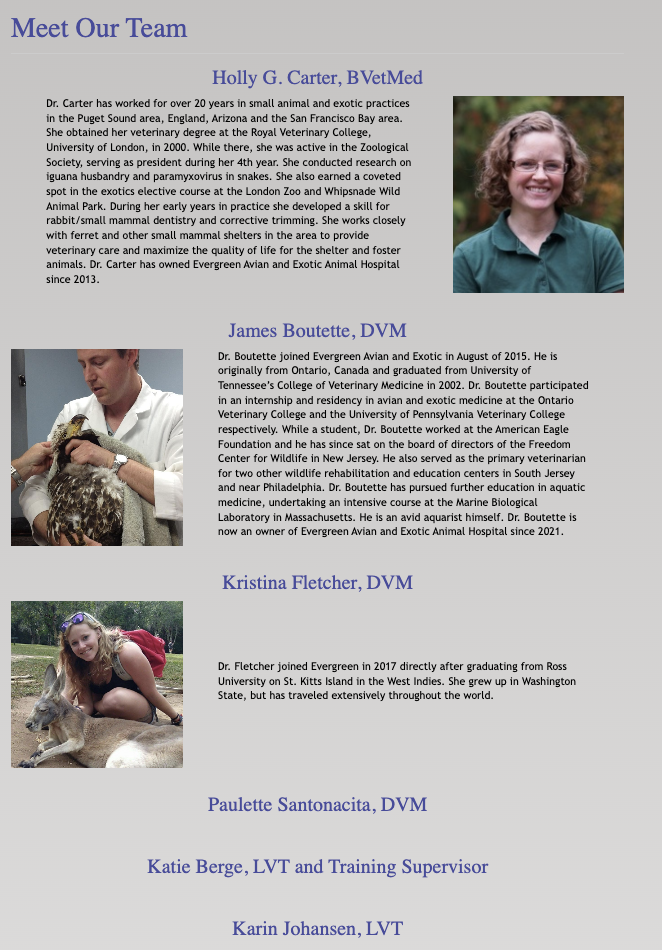
Our user research showed that users were put off by the overall look and feel of the site and did not want to engage with the content. The content was also severely outdated
We analyzed the design system, accessibility to develop a welcoming experience. We also worked with the staff to include updated information on their policies and team
Features:
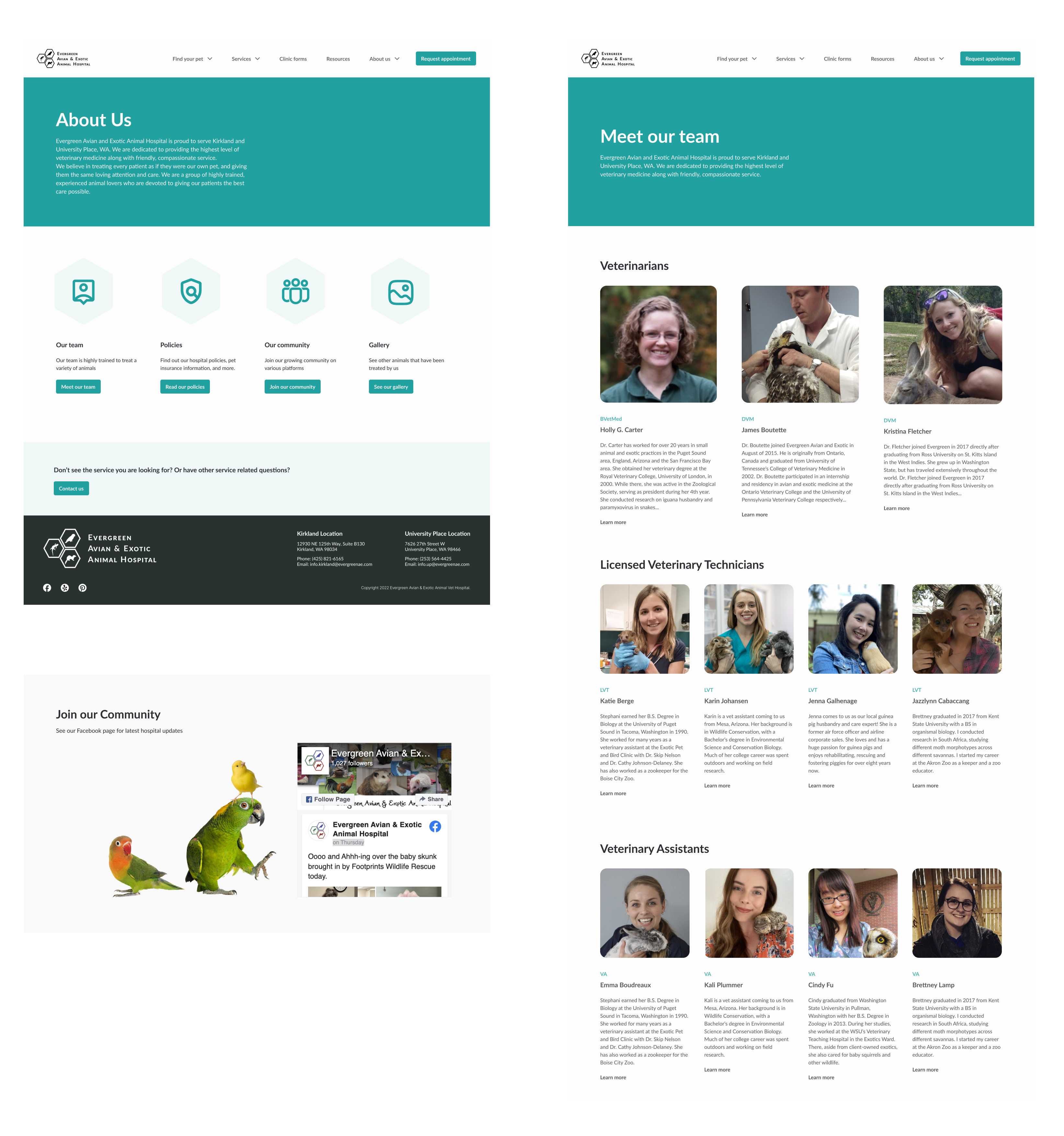
✪ Vibrant and modern branding
✪ Inclusive navigation for new and returning users
✪ Updated information on team and policies
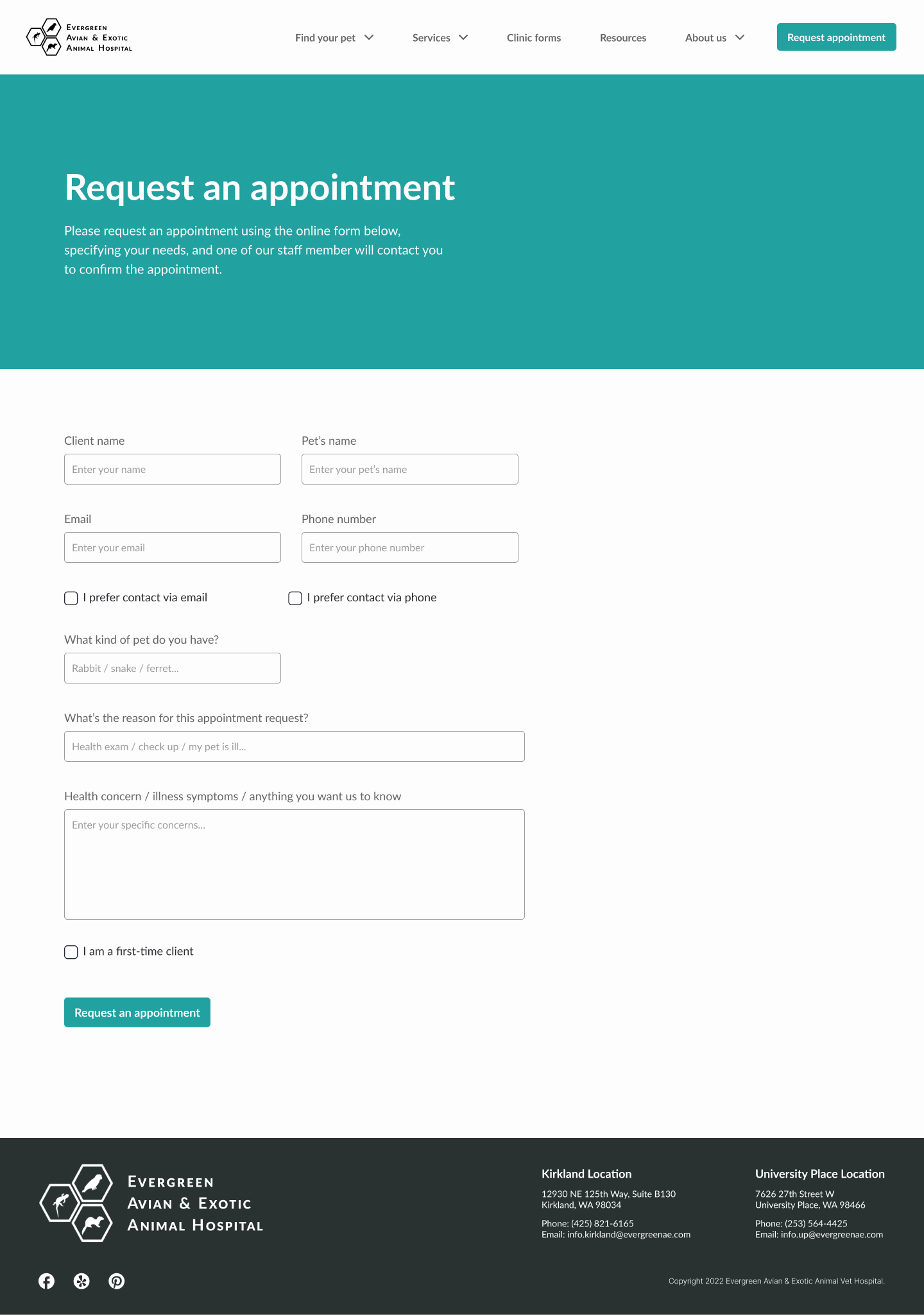
4. Appointment request
Our user research showed that users were unsure where to request or book an appointment so the called the office
We Worked with the staff to consolidate important information inputs for the appointment request. This allows the hospital to get in contact with clients rather than being bombarded with calls.
Features:
✪ Prominent CTA in the navigation
✪ easy web form to fill out
Delivery
Final designs
Reflection
Impact
- Our client got to think abouttheir online presence for the first time in 20 years when their website was first created
- Our client received detailed feedback on what their clients are lacking and wanting from the wholistic experience of their hospital visit, starting from the website.
- Avian and exotic pet owners will more easily navigate to the information they need for their pet's health needs
Learnings
- We often didn’t know what content we needed from the client until we started building which was then was difficult to coordinate with the client. Next time we would figure out earlier on which pages we would build out and request that information.
- We struggled with keeping all the pages consistent because we were all designing. We had to go back many times to create a solid design system and guidelines to coordinate everyone’s designs. Next time start with a solid design system!