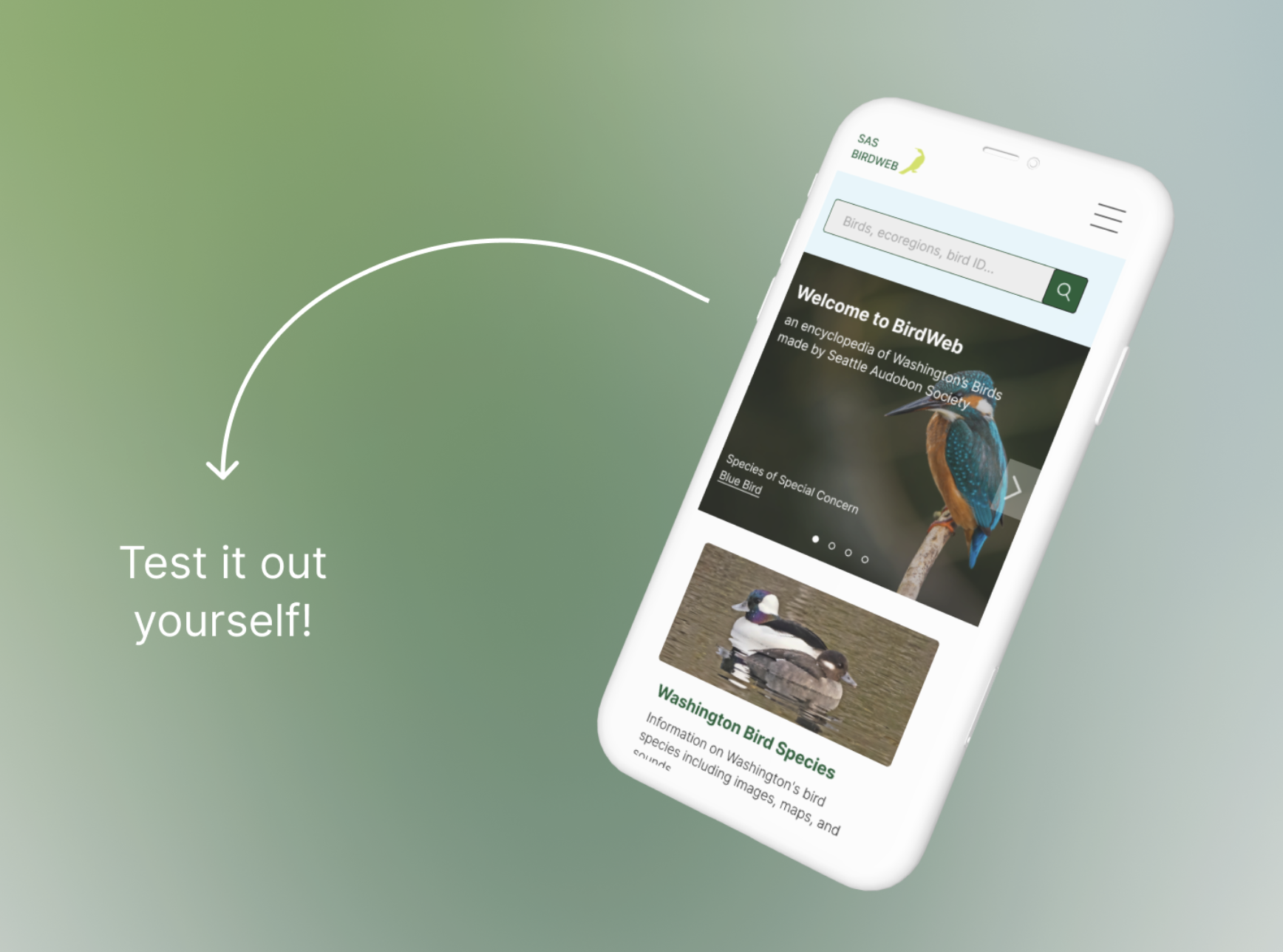
BIRDWEB
How might we help bird watchers in Washington identity birds when they are out in the field?
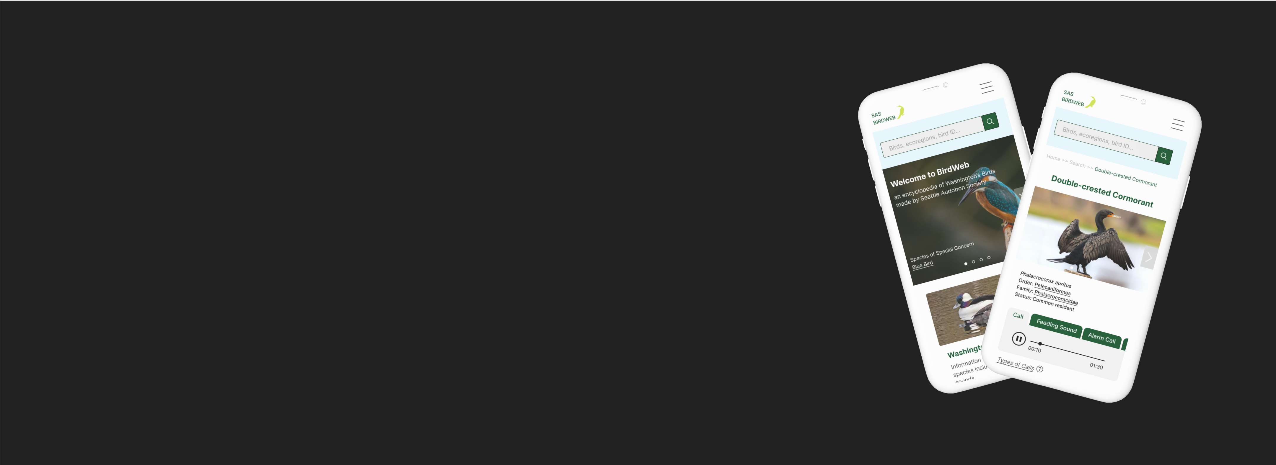
Redesigning the mobile site for Birdweb, a bird encyclopedia by the Seattle Audubon Society.
CLIENT
Seattle Audubon Society
ROLES
Team of 4;
designer
DURATION
8 Weeks
PROBLEM
Birdweb is a Washington state bird encyclopedia used by bird watchers to learn about and identify birds when out in the field. A Past site audit indicated that Birdweb is not accessible on mobile devices and is cumbersome to interact with. This is especially problematic as users of Birdweb are most likely accessing the site on a mobile device when bird watching.
Our team set out to redesign the mobile interface of the site for future birdwatchers of Washington State.
PROCESS
How do we made this product usable on mobile?
-- Our process and my roles within it

Understand
I conducted comparative Analysis and heuristic evaluation of current site
Research team conducted survey (N=212) and created persona. We also conducted accessibilty audit

Sketch & design
We Defined scope of work to focus on key features and collaboratively developed paper prototypes and mid fidelity prototypes

Test
I conducted 2 of 5 total usabilty tests
We conducted affinity diagramming and communicated with developers about feature feasibility

Refine
I designed the homepage and bird search feature after usability testing.
The team also worked on map, bird page features, and design system
UNDERSTAND
What info do birdwatchers need access to when in the field?
-- We used survey data with 212 responses from the research group to create a persona that represents our users needs

SKETCH & DESIGN
How might we make these tasks easier to acomplish?
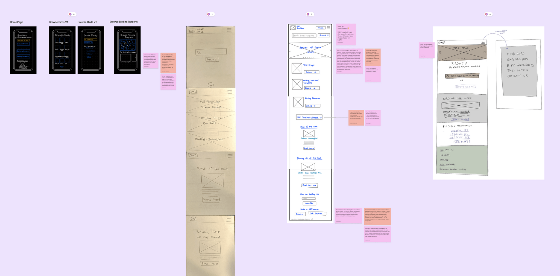
-- We started with paper wireframes ideas for the home page and 2 additional pages and moved forward to create mid-fidelity prototype we could test with users
WIREFRAME SKETCHES
MID FIDELITY PROTOTYPE
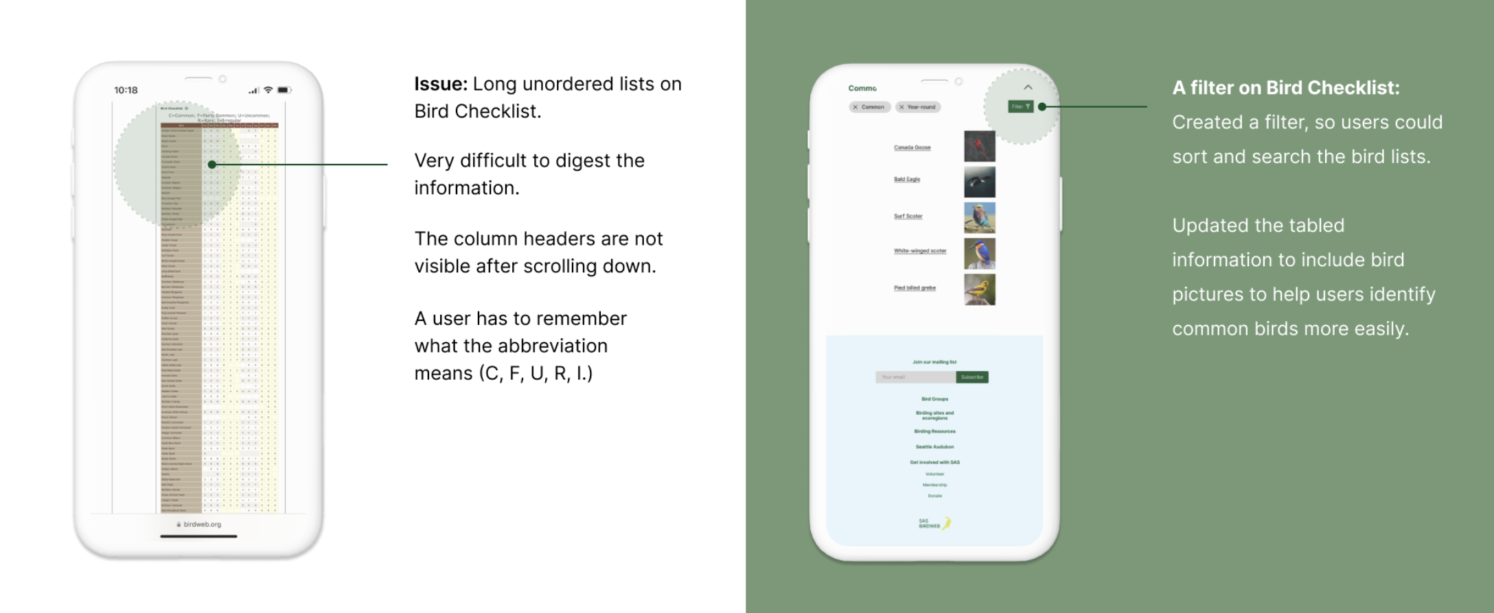
Feature #1: Bird Checklist
Feature #2: Clear CTA button
Feature #3: Bird sound player

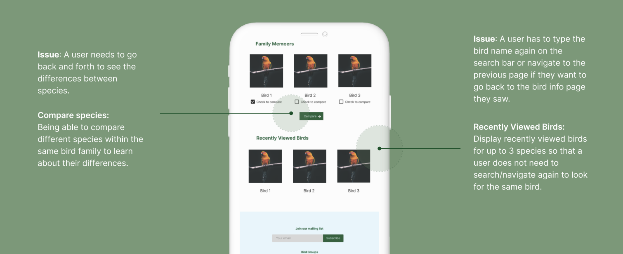
Feature #4: Compare Species
Feature #5: Recently Viewed Birds
TEST & REFINE
Are these features better?
-- We tested our mid-fidelity prototype with 5 users
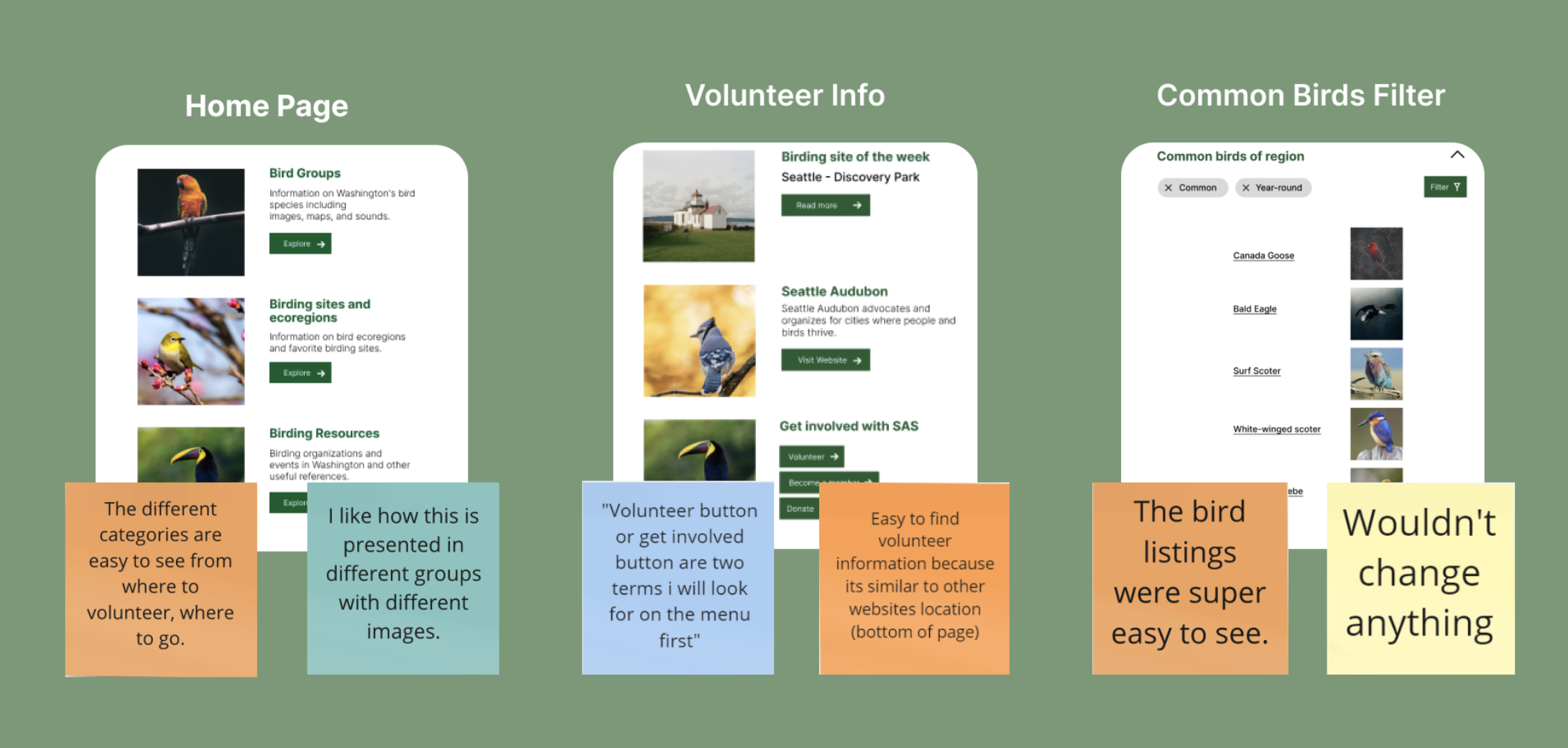
POSITIVE FEEDBACK
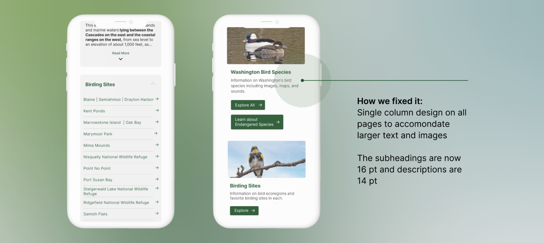
ISSUE #1: TEXT TOO SMALL

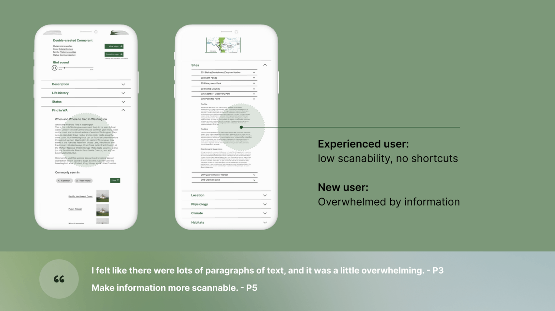
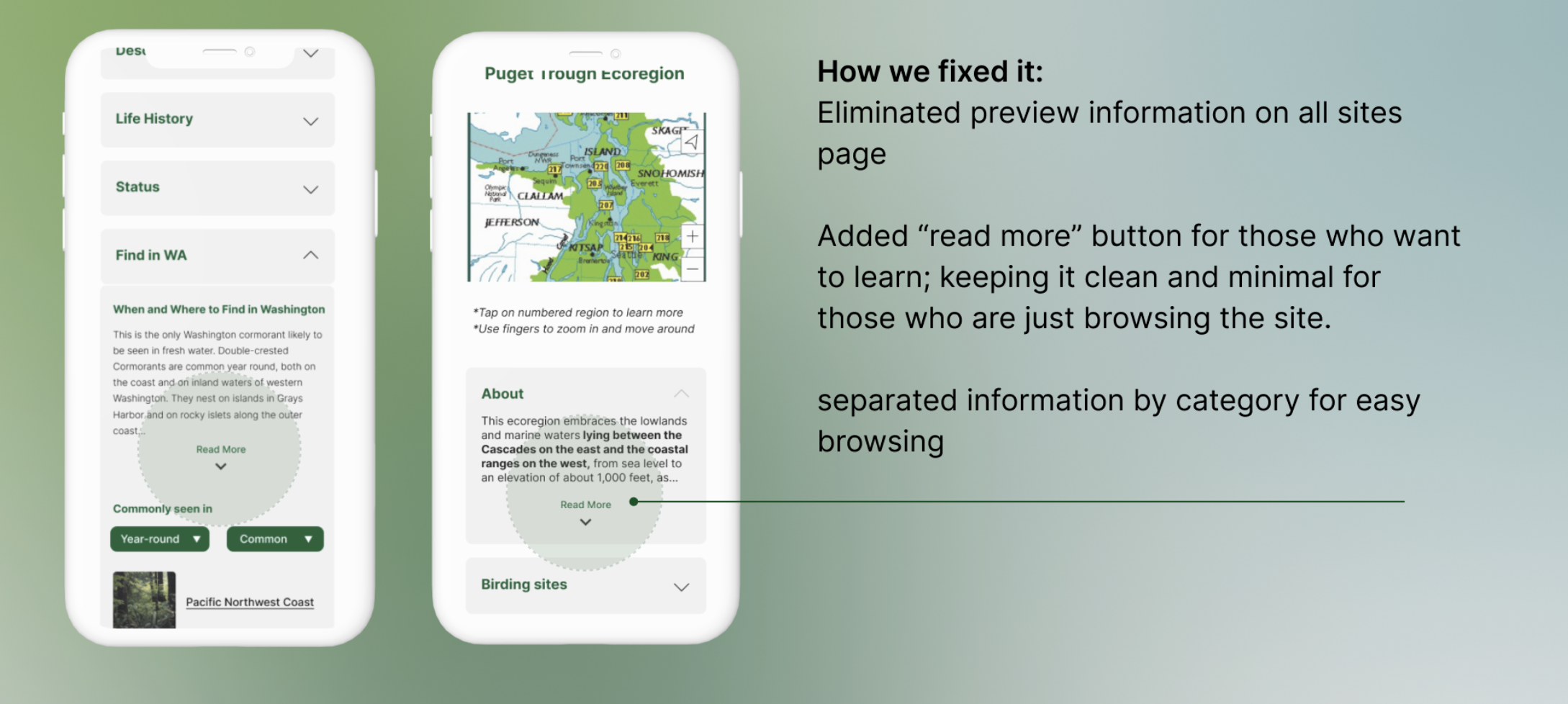
ISSUE #2: TOO MUCH INFORMATION
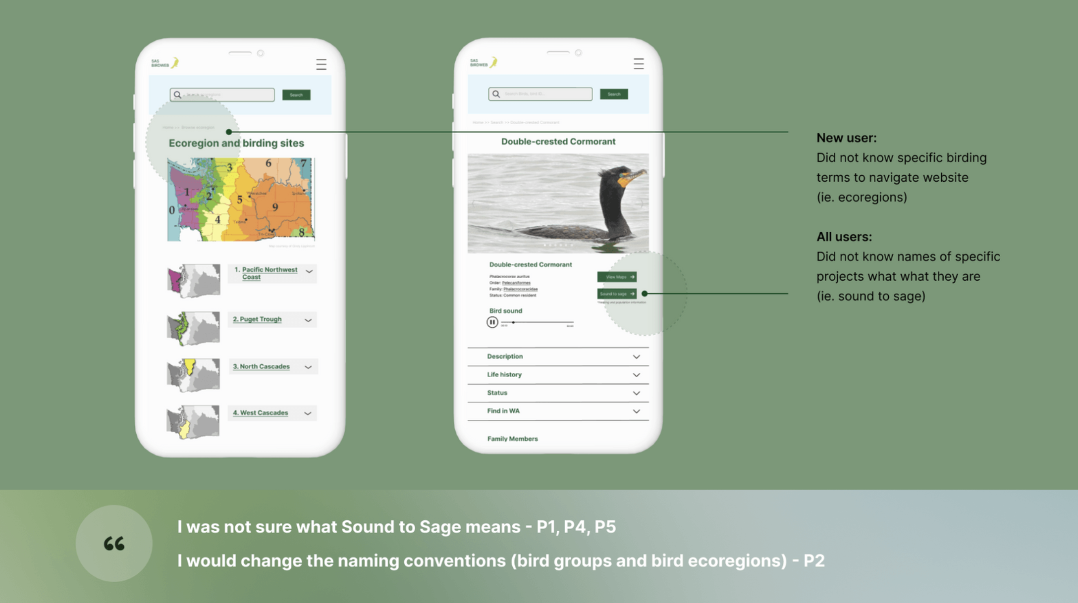
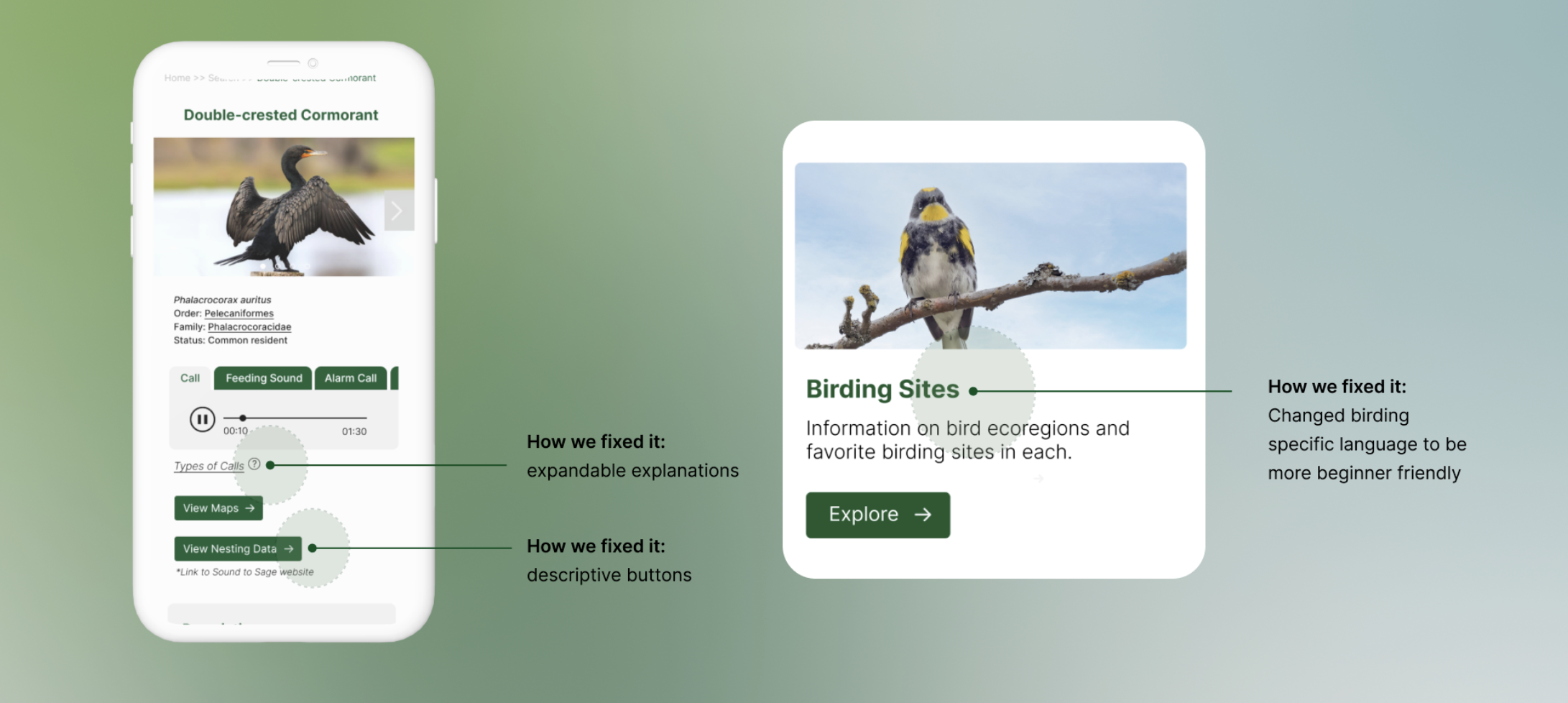
ISSUE #3: JARGON
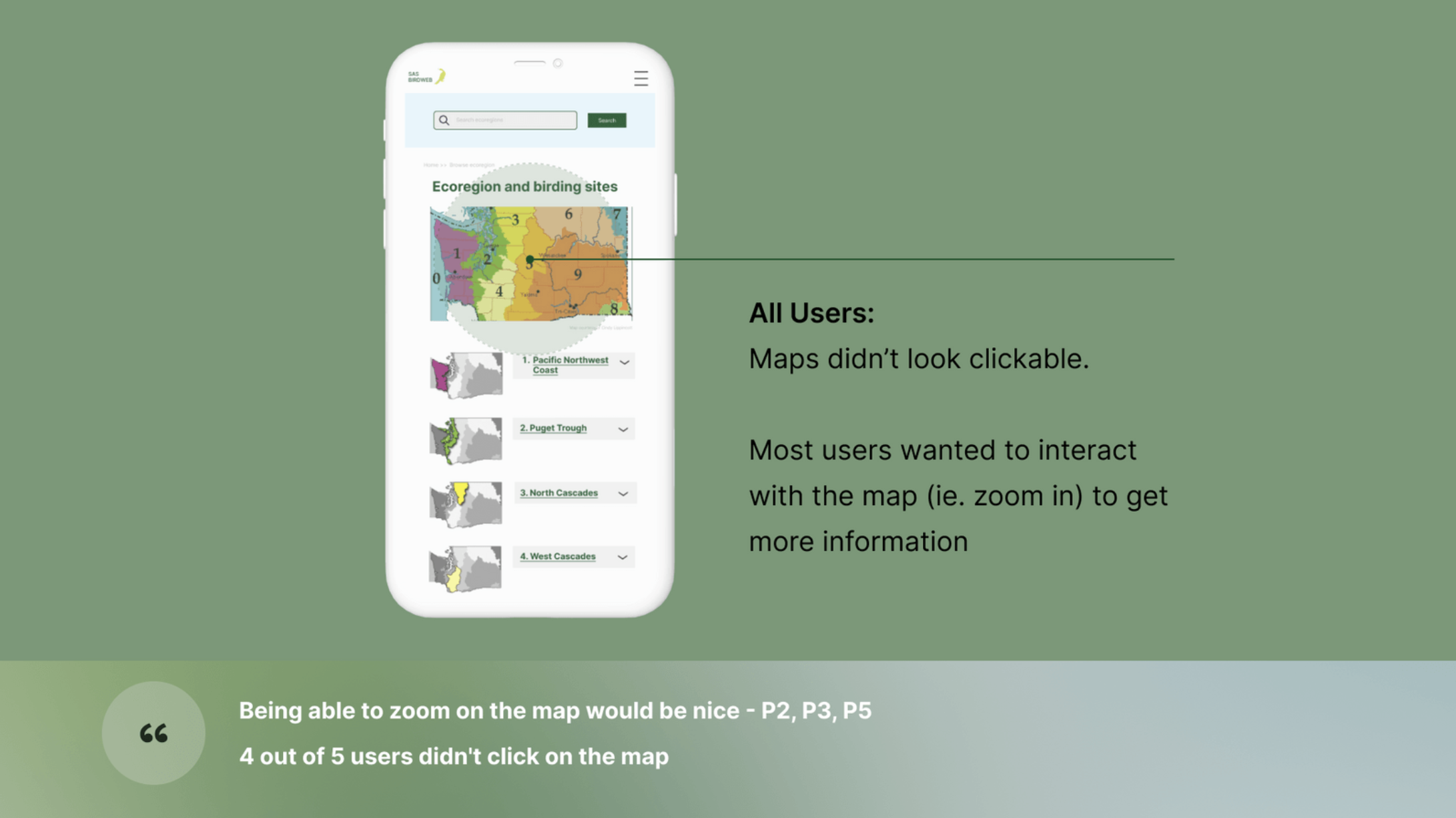
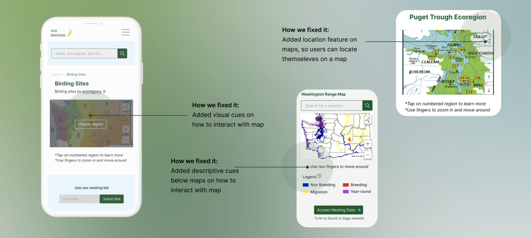
ISSUE #4: UNCLEAR MAP INTERACTION
FINAL PRODUCT
See our hi-fidelity prototype in action!
-- Let us know what you think
NEXT STEPS

LEARNINGS
Designing for digital interactions that primarily happen on a two dimensional plane requires a lot of testing to see how users perceive 2D visuals and what they can do to interact with it.
Small changes make a big difference. An element like font size is the first thing people notice, even though its an easy fix.
Everybody needs good UX design. It's not just restricted to the tech industry. Each industry has their needs when it comes to accessing information and using digital tools, even a website for birdwatcher to identify birds!

